Color Psychology in Film: How Directors Use Color to Tell Stories
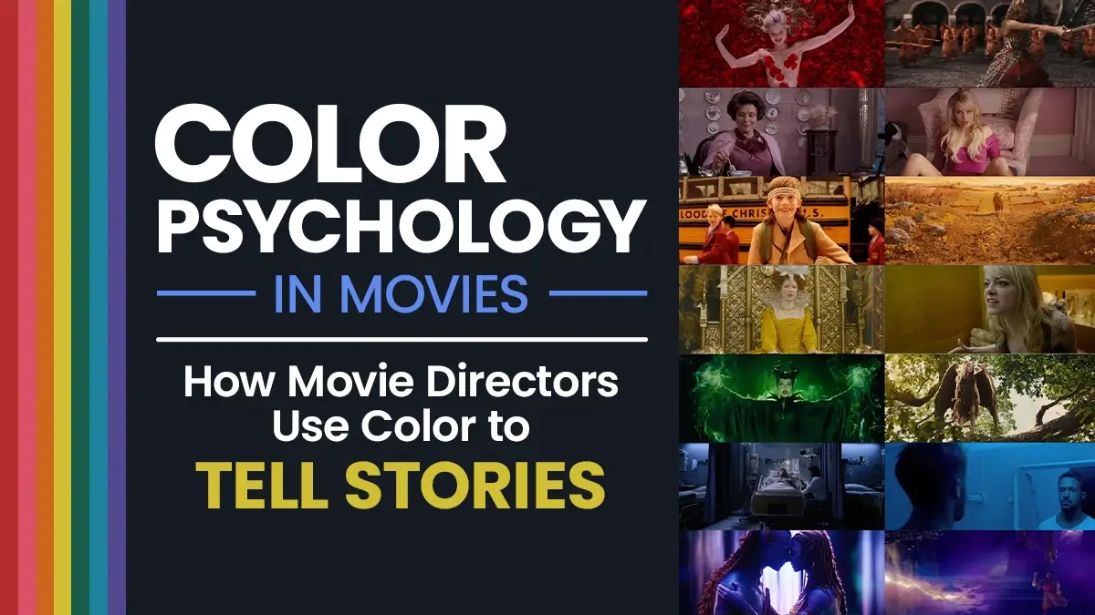
Color psychology in film is one of the most powerful storytelling tools in cinema. Before a single line of dialogue is spoken, color is already shaping emotions, guiding audience perception, and supporting the story.
Before a single line of dialogue is spoken, before the plot begins, color is already telling you how to feel. It shapes your emotional response, signals a character’s arc, and primes your subconscious for what is about to happen. The best directors in the world use color the same way composers use music – not to decorate a scene, but to deepen it.
This guide breaks down how color psychology in film works, what each major color communicates in a cinematic context, and how the greatest filmmakers have used it to tell better stories.
What Is Color Psychology in Film?
Color psychology in film is the deliberate use of color to influence how an audience feels and thinks during a scene. It is not random. Every major color decision in a professional production – from costume choices to set design to color grading in post-production – is intentional. Also read Ultimate Color Thesaurus for Every Imagineable Shade
Why Color Affects Human Emotions
The reason it works is rooted in how human beings process color below the level of conscious thought. Warm tones like red and orange trigger physical and emotional arousal. Cool tones like blue and green slow the nervous system and create psychological distance. These responses are partly biological and partly cultural – which is why context always matters. You can also explore this detailed color psychology infographic guide for deeper insights.
As one film color expert puts it: a deep blue filter in a horror scene invokes cold dread, while the same blue in a tranquil drama evokes serenity. The color does not carry meaning on its own – it carries meaning in relation to the story around it. Curious about your personality? Discover what your favorite color says about you.
How Color Psychology in Film Influences Audience Emotions
The infographic below, created by StudioBinder, is one of the most widely referenced visual breakdowns of color psychology in cinema. It maps the major colors used by filmmakers against the emotions they typically evoke – covering everything from the aggressive energy of red to the clinical coldness of white.
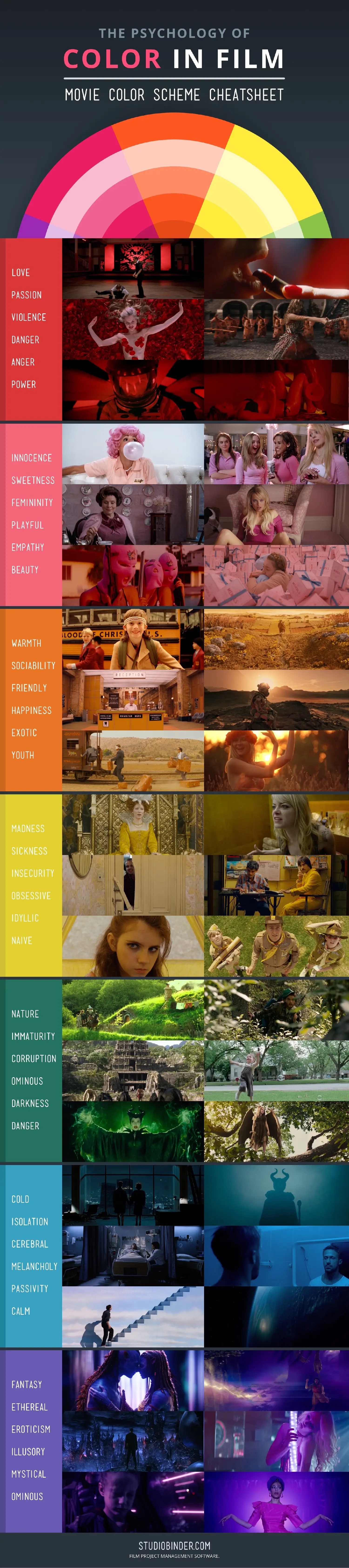
Below the infographic, we break down each major color in detail – with real examples from famous films.
Red – Danger, Passion, and Power
Red is the most emotionally intense color in cinema. As a result, it demands attention and signals urgency. Depending on context, red can mean love, lust, danger, violence, or obsession. Check out different shades of red color with HEX & RGB codes.
What red communicates in film:
- Passion and romantic desire
- Danger, threat, or warning
- Power and dominance
- Violence and blood
- Obsession
Real movie examples:
- Schindler’s List (1993) – Spielberg used a red coat on a young girl in an otherwise black-and-white film. The single burst of color made her visible, human, and unforgettable – and marked her death as the moment the horror became undeniable.
- The Sixth Sense (1999) – Director M. Night Shyamalan used red as a consistent signal whenever something from the supernatural world was present in a scene. Most viewers never consciously noticed it.
- American Beauty (1999) – Red roses run throughout the film as a symbol of desire, beauty, and the dangerous obsession underneath ordinary suburban life.
Blue – Isolation, Calm, and Melancholy
Similarly, blue is one of the most commonly used colors in film for emotional distance, sadness, and introspection. It cools a scene down psychologically, creating a sense of stillness – or loneliness.
What blue communicates in film:
- Sadness and melancholy
- Isolation and loneliness
- Calm and stability
- Cold and clinical detachment
- The supernatural or unknown
Real movie examples:
- Moonlight (2016) – Barry Jenkins saturated the entire film in deep blues and teals to reflect the emotional isolation and identity struggles of the main character across three stages of his life.
- Requiem for a Dream (2000) – The cool blue palette throughout the film creates a clinical, detached quality that makes the characters’ descent feel inevitable and hopeless.
- Frozen (2013) – The consistent blue and white palette communicates both the physical cold of Elsa’s powers and the emotional coldness of her self-imposed isolation.
Blue is far more nuanced than most people realize. From soft Sky Blue and calming Azure to dramatic Navy and mysterious Indigo, each shade carries its own emotional weight and visual impact. If you’re looking to explore the complete spectrum, check out our guide to 100+ Shades of Blue with HEX and RGB Codes for color names, meanings, and design inspiration.
Yellow – Joy, Naivety, and Instability
Yellow is the most psychologically complex color in cinema. At low saturation it communicates warmth and happiness. At high saturation it can shift quickly toward anxiety, instability, and madness.
What yellow communicates in film:
- Joy and optimism
- Naivety and innocence
- Cowardice or betrayal
- Mental instability or heightened emotion
- Warning and caution
Real movie examples:
- Kill Bill (2003) – The Bride’s iconic yellow tracksuit signals both her martial arts heritage and her single-minded, almost feverish focus on revenge.
- Se7en (1995) – The sickly yellow-green tones throughout the film create a constant low-level unease – nothing feels clean, nothing feels safe.
- Breaking Bad – Walter White’s transformation from naive teacher to dangerous criminal is tracked partly through color. Yellow appears heavily in his early scenes as a symbol of his chemistry world and the approaching toxicity of his choices.
Green – Nature, Envy, and Corruption
Meanwhile, green occupies a unique position in film color psychology because it carries both positive and negative associations simultaneously. Natural green signals life and growth. Artificial or sickly green signals corruption, poison, and moral decay.
What green communicates in film:
- Nature and growth
- Envy and greed
- Corruption and toxicity
- The supernatural or alien
- Money and wealth (often with negative connotations)
Real movie examples:
- The Matrix (1999) – The entire digital world of the Matrix is rendered in a distinctive green tint, visually separating the simulated reality from the real world and signaling that the Matrix is fundamentally unnatural.
- Parasite (2019) – Bong Joon-ho used green throughout the Park family’s wealthy home to signal the suffocating, artificial nature of their privilege – and how it corrupts everyone who enters.
- Wicked (2024) – Elphaba’s green skin is the most literal use of green’s dual symbolism – she is simultaneously connected to nature and magic while being marked as different, threatening, and envied.
White – Purity, Emptiness, and Clinical Cold
However, white in film is more complex than many viewers realize. On the surface it signals cleanliness and innocence. In practice, filmmakers frequently use white to communicate emptiness, sterility, and a kind of emotional blankness that can be more unsettling than darkness.
What white communicates in film:
- Purity and innocence
- Clinical detachment
- Emptiness and absence
- Heaven, death, or the afterlife
- Conformity and control
Real movie examples:
- One Flew Over the Cuckoo’s Nest (1975) – The white walls and uniforms of the psychiatric ward communicate institutional control and the erasure of individual identity.
- The Road (2009) – The bleached white landscapes signal the complete absence of life – a world that has been emptied of everything that gave it meaning.
Black – Death, Mystery, and Authority
Black is the color of shadows and the unknown. In cinema it carries associations of death, mourning, power, and moral ambiguity. Villains are dressed in black not because it is a cliche but because it works – the association between black and threat is deeply embedded in human psychology.
What black communicates in film:
- Death and mourning
- Mystery and the unknown
- Power and authority
- Evil and moral corruption
- Sophistication and elegance (context-dependent)
Real movie examples:
- Darth Vader – The all-black costume is the definitive cinematic example of color as character. The black armor communicates authority, threat, and moral darkness before Vader says a single word.
- Schindler’s List (1993) – The use of black-and-white throughout the film removes the comforting distance of color, forcing the audience to experience the events as documentary reality rather than dramatic fiction.
Orange – Warmth, Energy, and Danger
Orange sits between red and yellow – it carries the energy of red without its aggression, and the warmth of yellow without its ambiguity. In film it is frequently used to signal warmth, nostalgia, and the energy of action sequences. It is also the complementary color to teal, which is why the teal-and-orange color grade became the dominant look of Hollywood blockbusters for over a decade.
What orange communicates in film:
- Warmth and comfort
- Energy and action
- Adventure and freedom
- Nostalgia
- Fire and destruction
Real movie examples:
- Mad Max: Fury Road (2015) – The desert sequences are drenched in orange and amber, communicating the heat, aggression, and relentless forward energy of the chase.
- Blade Runner 2049 (2017) – The orange-saturated wasteland sequences contrast sharply with the cool blue interiors, visually separating the dead outside world from the controlled artificial world inside.
Color Psychology in Film: How Directors Control Color
Understanding what colors mean is only part of the picture. The other part is understanding how filmmakers actually control and apply color across a production.
1. Production Design
Color decisions begin before a single frame is shot. Production designers choose set colors, prop colors, and costume colors in advance based on the emotional map of the film. Every element in the frame is a color decision.
2. Cinematography and Lighting
The color of light changes everything. Warm tungsten light turns a scene amber and intimate. Cool daylight turns it blue and distant. Cinematographers use gels, practical lights, and natural light sources to push scenes toward their intended emotional temperature.
3. Color Grading
Color grading is the post-production process of adjusting the color of the final image. This is where the overall look of the film is locked in – contrast, saturation, color temperature, and specific color pushes are all handled here. Modern color grading gives filmmakers precise control over every color in every frame.
Color Psychology in Film: Quick Reference Guide
| Color | Primary Emotions | Common Usage |
|---|---|---|
| Red | Danger, passion, power | Threat, love, violence, obsession |
| Blue | Sadness, isolation, calm | Melancholy, distance, the supernatural |
| Yellow | Joy, naivety, instability | Innocence, warning, madness |
| Green | Nature, envy, corruption | The Matrix, poison, wealth |
| White | Purity, emptiness, control | Institutions, death, conformity |
| Black | Death, mystery, authority | Villains, mourning, power |
| Orange | Warmth, energy, adventure | Action, nostalgia, fire |
FAQ
Common Questions About Color Psychology in Film
Color psychology in film is the deliberate use of color to influence audience emotions and communicate meaning without dialogue. Directors, production designers, and cinematographers choose color palettes intentionally to shape how a scene feels and what it means.
Directors use color through production design (sets and costumes), cinematography (color of light), and post-production color grading. Each approach allows precise control over the emotional temperature of a scene and the symbolic associations it carries.
Blue in film typically communicates sadness, isolation, melancholy, or emotional distance. It is frequently used in scenes of loneliness, grief, or introspection. At its extreme, blue can feel clinical and cold – used heavily in dystopian and horror settings.
Red in movies most commonly signals danger, passion, power, or violence. It is the most emotionally intense color in cinema and is frequently used to mark moments of threat, desire, or obsession – often appearing right before a turning point in the story.
The teal and orange color grade became the dominant Hollywood blockbuster look because teal and orange are complementary colors that create strong contrast. Human skin tones are naturally orange, so pushing shadows to teal creates a visually striking split that makes subjects pop from their backgrounds.
Color symbolism works because much of our response to color happens below the level of conscious thought. Filmmakers use it to communicate subtext – feelings, character states, and narrative themes – that would be too heavy-handed if stated in dialogue.
Don’t Miss
Don't Miss
Shades of Green: 100+ Green Color Names with HEX & RGB Codes
Shades of Blue: 100+ Blue Color Names with HEX & RGB Codes
It’s Bubblegum, Not ‘Light Pink’: The Ultimate Color Thesaurus for Every Imagineable Shade
15 Best Color Combinations for Logo Design (With HEX Codes & Examples)

These 10 Bad Habits Are Killing Your Productivity