15 Best Color Combinations for Logo Design (With HEX Codes & Examples)
Choosing the best color combinations for logo design is one of the most important steps in building a strong brand identity. Colors are not just visual elements — they influence emotions, create recognition, and communicate your brand message instantly.
Whether you are a graphic designer, business owner, or content creator, using the right color palette can make your logo stand out and look more professional. In this guide, we have curated 15 powerful logo color combinations along with HEX codes and real-world examples to help you choose the perfect palette.
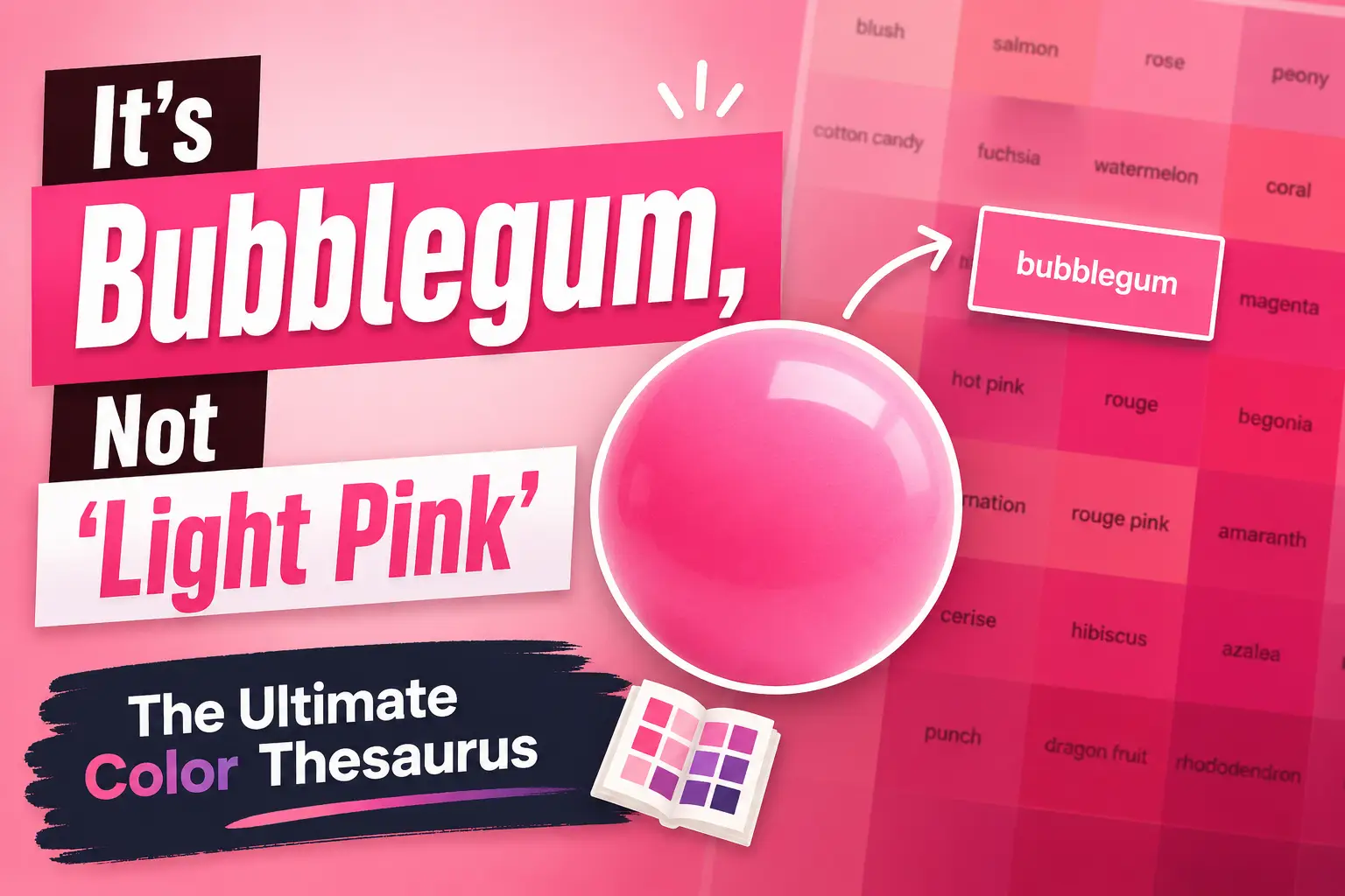
If you want to explore more variations of red tones, check out our detailed guide on shades of red color with HEX codes, where you’ll find 100+ red shades perfect for branding and design inspiration.
Why Color Combinations Matter in Logo Design
Colors play a crucial role in branding. The right combination can create trust, excitement, luxury, or creativity depending on how they are used. For example, blue is often associated with trust and professionalism, while red represents energy and passion.
A well-balanced color combination improves readability, visual appeal, and memorability of your logo. That’s why top brands carefully choose their color palettes to match their identity.
How to Choose the Best Color Combination
Before selecting colors, consider your brand personality and target audience. Here are a few quick tips:
- Use contrasting colors for better visibility
- Stick to 2–3 colors for a clean look
- Choose colors based on the emotion you want to convey
- Test your colors on both light and dark backgrounds
If you’re just starting out, you can also read our complete how to design a logo step-by-step guide to understand the full logo creation process.
Best Color Combinations for Logo Design
Below are some of the most effective and widely used color combinations that work across industries. Each combination includes HEX codes and real brand examples to help you understand how they are used in the real world.
1. Red and Black Logo Color Combination (HEX Codes)
Red
#E32636
Black
#000000
Best for: Bold, powerful brands
Examples: Netflix, YouTube
Blue and White Logo Color Combination (HEX Codes)
Blue
#1E3A8A
White
#FFFFFF
Best for: Corporate, tech brands
Examples: Facebook, LinkedIn
3. Yellow and Black Logo Color Combination (HEX Codes)
Yellow
#FFD700
Black
#000000
Best for: Bold, attention brands
Examples: McDonald’s, Nikon
4. Purple and Gold Logo Color Combination (HEX Codes)
Purple
#6A0DAD
Gold
#FFD700
Best for: Luxury brands
Examples: Cadbury, Hallmarke
5. Green and White Logo Color Combination (HEX Codes)
Green
#2ECC71
White
#FFFFFF
Best for: Eco, health brands
Examples: Whole Foods, Tropicana
6. Orange and Blue Logo Color Combination (HEX Codes)
Orange
#FF7F50
Blue
#1E90FF
Best for: Creative brands
Examples: Firefox, Fanta
7. Pink and Black Logo Color Combination (HEX Codes)
Pink
#FF69B4
Black
#000000
Best for: Fashion brands
Examples: Barbie, Victoria’s Secret
Navy
#001F3F
Gold
#FFD700
Best for: Premium brands
Examples: Rolex, Ralph Lauren
9. Red and White Logo Color Combination (HEX Codes)
Red
#FF0000
White
#FFFFFF
Best for: Clean bold brands
Examples: Coca-Cola, Red Cross
10. Teal and Gray Logo Color Combination (HEX Codes)
Teal
#008080
Gray
#808080
Best for: Minimal brands
Examples: Intel, Slack
Coral
#FF6F61
Navy
#002B5B
Best for: Modern branding
Examples: (UI/Startup brands)
12. Burgundy and Beige Logo Color Combination (HEX Codes)
Burgundy
#800020
Beige
#F5F5DC
Best for: Elegant brands
Examples: (Luxury packaging)
13. Black and Gold Logo Color Combination (HEX Codes)
Black
#000000
Gold
#FFD700
Best for: Luxury identity
Examples: Chanel, Versace
14. Orange and Dark Gray Logo Color Combination (HEX Codes)
Orange
#FF6600
Dark Gray
#333333
Best for: Tech & startup
Examples: SoundCloud
15. Vimeo Blue and White Logo Color Combination (HEX Codes)
Vimeo Blue
#87CEEB
White
#FFFFFF
Best for: Fresh & clean brands
Examples: Vimeo
FAQs About Logo Color Combinations
1. What is the best color combination for logo design?
The best color combination for logo design depends on your brand identity and target audience. Popular combinations include red and black for bold brands, blue and white for corporate trust, and black and gold for luxury branding.
2. How many colors should a logo have?
A logo should ideally have 2 to 3 colors. Using too many colors can make your design look cluttered, while a limited palette keeps it clean, professional, and easy to remember.
3. Why are color combinations important in branding?
Color combinations play a crucial role in branding because they influence emotions, perception, and recognition. The right colors can make your brand more memorable and trustworthy.
4. Which color is best for a professional logo?
Blue is considered one of the best colors for a professional logo because it represents trust, reliability, and stability. That’s why many corporate brands use blue in their logos.
5. How do I choose the right colors for my logo?
To choose the right colors, consider your brand personality, industry, and target audience. Use contrasting colors for visibility and test your design on both light and dark backgrounds.
6. What tools can I use to create color combinations?
You can use tools like Canva, Adobe Color, and Coolors to create and experiment with color palettes. These tools help you generate professional combinations quickly.
7. Can I use the same color combinations as big brands?
Yes, you can take inspiration from big brands, but avoid copying directly. Try to customize the shades and combinations to create a unique brand identity.
Don't Miss
Shades of Green: 100+ Green Color Names with HEX & RGB Codes
How to Design a Logo: Know All About the Logo Design Process
Shades of Blue: 100+ Blue Color Names with HEX & RGB Codes

Color Psychology in Film: How Directors Use Color to Tell Stories
10+ Best Logo Design Books Every Designer Must Read in 2026