
Principles of Visual Design: Complete Guide for Designers
Every great design looks effortless. But behind every logo, poster, website, and UI you’ve ever admired is a set of principles working quietly in the background – directing your eye, creating meaning, and making the whole thing feel right.
These are the principles of visual design. Once you understand them, you’ll see them everywhere – and your own work will never be the same.
The 10 Principles of Visual Design
- Visual Concept
- Point, Line, and Shape
- Color
- Typography
- Negative Space
- Balance
- Scale
- Alignment and Grid
- Framing
- Texture and Pattern
1. Point, Line, and Shape
Everything in visual design starts here. No matter how complex a design looks – a brand identity, a movie poster, a mobile UI – it is built entirely from three primitive elements: points, lines, and shapes.

A point is the most basic mark you can make. Connect two points and you get a line. Connect three points and you have a shape. From these three building blocks, you can construct anything.
This matters practically because it changes how you approach complex design problems. When a composition feels wrong, strip it back to its basic shapes and lines. Is the geometry balanced? Are the shapes working together or fighting each other? Solving it at the primitive level fixes it everywhere.
Real example: The Nike Swoosh is a single curved line. The Apple logo is a circle with a bite taken out and a leaf added. FedEx’s logo hides an arrow between two letterforms. Iconic logos are almost always built from the simplest possible geometry.
2. Color
The human eye can see over 10 million colors. But color in design is not about using many – it’s about using the right ones with intention.
Color communicates before words do. It triggers emotional associations, signals brand personality, and directs attention. The key insight: these associations are largely learned, not hardwired. Red means danger in a Western context but luck in Chinese culture. This means you must always design color for your specific audience.

How to use color effectively:
- Limit your palette – 2 to 3 colors for most designs, with one dominant, one supporting, one accent
- Use contrast intentionally – your most important element should have the highest color contrast
- Consider meaning – research color associations for your specific audience and industry
- Test in grayscale first – if your design doesn’t work without color, the layout is too dependent on it
Common mistake: Choosing colors you personally like rather than colors that serve your audience and message. Color is a communication tool, not decoration.Well, these choices are also important in design. The right choice of colors makes a design more beautiful and appealing.
3. Typography
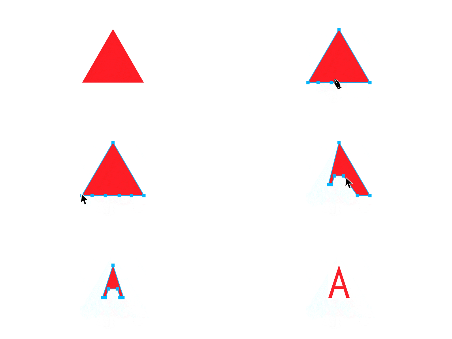
Typography is how your words look. And how your words look changes how they feel – and whether people read them at all.
With the right typeface, ordinary copy becomes powerful. With the wrong one, even brilliant writing falls flat. Typography defines tone faster than almost any other design decision.
The practical rules:
- Serif fonts – traditional, trustworthy, authoritative. Great for editorial, luxury, and long-form reading
- Sans-serif fonts – clean, modern, accessible. Dominant in digital UI and tech branding
- Display fonts – expressive, personality-driven. Headlines only – never body text
- Pair two fonts maximum – one for headlines, one for body. Add a third only when there’s a specific reason
- Size creates hierarchy – your headline should be at least 2x the size of your body text
The rule most designers break: Using too many typefaces. Every font you add without purpose dilutes your visual system. Stick with the classics unless you have a specific reason to go elsewhere.
For example, taking a kid-like cartoony font for a serious building project is a strict no-no. The selection of font should be according to the project’s requirements. Thus, a designer must keep in mind the golden rules for combining fonts.
4. Negative Space
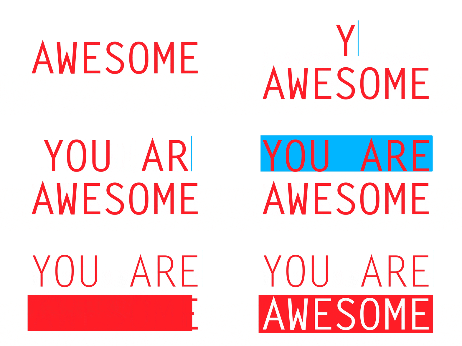
Negative space in design has two levels – the space around your overall composition, and the space between individual letters. Both matter enormously, but the one most beginners overlook is kerning – the space between characters in typography.
Kerning is the adjustment of space between individual letter pairs. Done well, it’s invisible – the text simply reads smoothly and naturally. Done poorly, it creates awkward gaps or cramped clusters that make text uncomfortable to read and unprofessional to look at.

Why kerning matters:
- Every typeface has default spacing that works generally but not always perfectly – especially at large display sizes
- Certain letter combinations – AV, WA, To, Ty – naturally create optical gaps that need manual tightening
- Headlines and logos need tighter attention to kerning than body text because every letter pair is highly visible
The broader principle: Every element in your design needs the right amount of breathing room – not too tight, not too loose. Too little space feels cramped and anxious. Too much space feels unfinished and disconnected. Finding the right ratio between positive and negative space is one of the core skills of experienced designers.
The beginner mistake: Ignoring kerning entirely and trusting default spacing. At body text sizes this is fine. At headline and logo sizes, bad kerning is immediately visible to any trained eye.
5. Balance, Rhythm & Contrast
Balance is the distribution of visual weight across your composition. A balanced design feels stable and complete. An unbalanced one feels uncomfortable – though sometimes that discomfort is used intentionally for tension or energy.
Three types of balance:
Symmetrical balance – Elements mirror each other across a central axis. Formal, stable, trustworthy. Used in luxury brands, government identities, and ceremonial design.
Asymmetrical balance – Different elements on each side carry equal visual weight. A large simple shape balanced against several smaller complex ones. More dynamic and interesting than symmetry. Most modern editorial and digital design uses asymmetrical balance.
Radial balance – Elements radiate from a central point outward. Used in badges, seals, mandalas, and certain logo styles.
Visual weight is not just about size. A small dark shape can balance a large light one. A single bold word can balance a full paragraph of body text. Learning to feel visual weight – and adjust it – is one of the core skills of experienced designers.
It is also important to maintain the rhythm and contrast into designing to make the design more effective. The client and others must be able to understand the concept of designing just by looking at it, without much explanation.
6. Scale
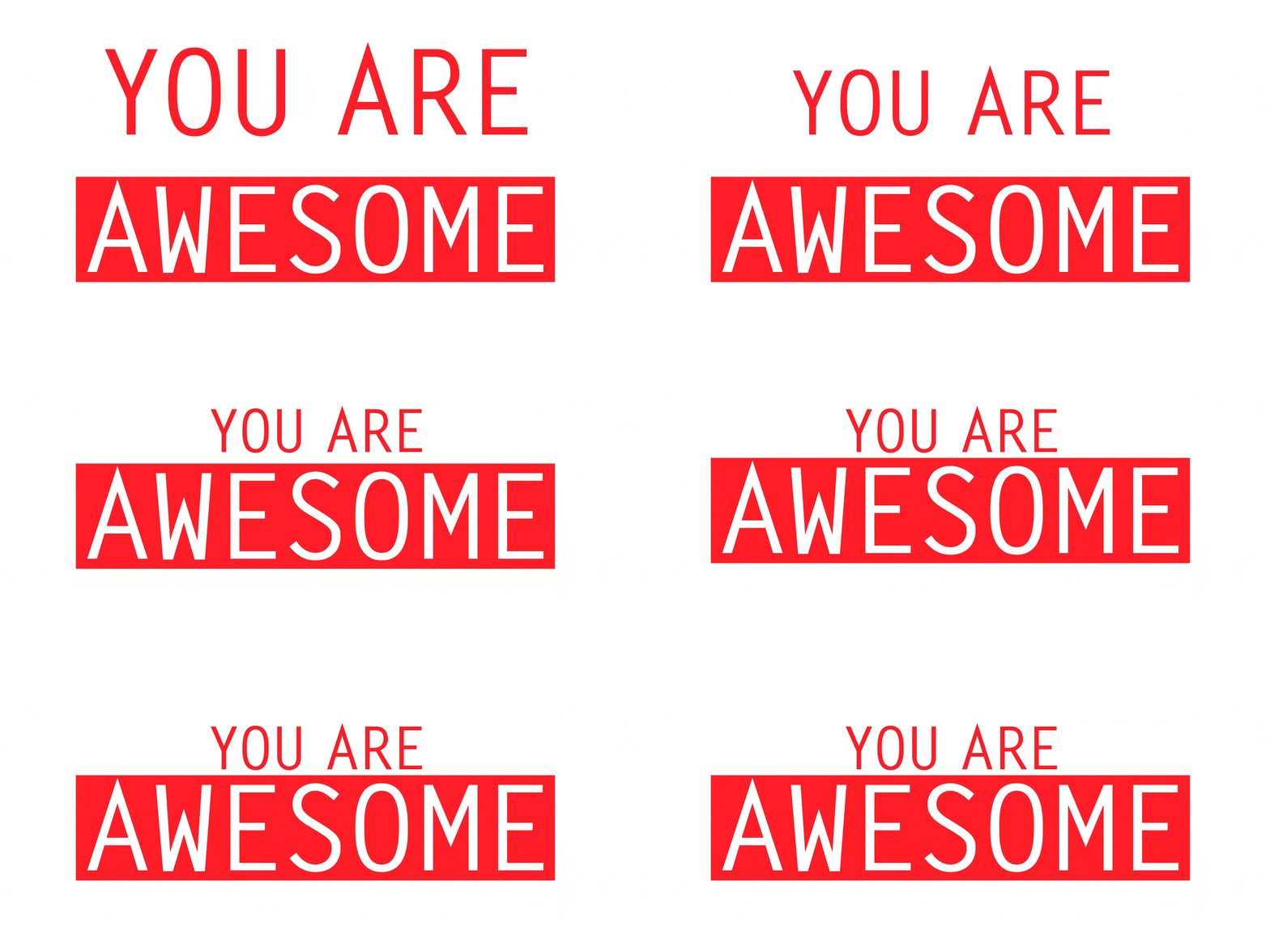
Scale is the deliberate use of size differences to create hierarchy, contrast, rhythm, and emphasis in your design.
Not all elements in a design should be the same size. Size communicates importance. The biggest element on any page is what the viewer reads first. This is why newspaper headlines are large – they let you scan the page quickly to find what’s relevant to you.
Scale in practice:
- Establish a clear size hierarchy – headline, subheading, body text, caption, each at a distinct size
- Make the contrast dramatic – a 20px headline next to 16px body text creates almost no visual hierarchy. A 48px headline next to 16px body text creates a strong one
- Use scale to create rhythm – alternating large and small elements creates movement and visual interest
- Never scale up logos “just because” – size should always serve a purpose, not ego
The trap: Making your logo bigger doesn’t make your design better. Make the element that communicates your message the most prominent element. That is what scale is for.
7. Alignment and Grid
Alignment is the principle that every element in your design has a visual connection to something else. Nothing is placed arbitrarily. Everything lines up.
A grid is the invisible structure that makes alignment systematic. Grids give you consistent columns, margins, and spacing increments that your type, images, and UI components all snap to. Open any well-designed book, magazine, or website and you’ll see a grid operating beneath the surface.
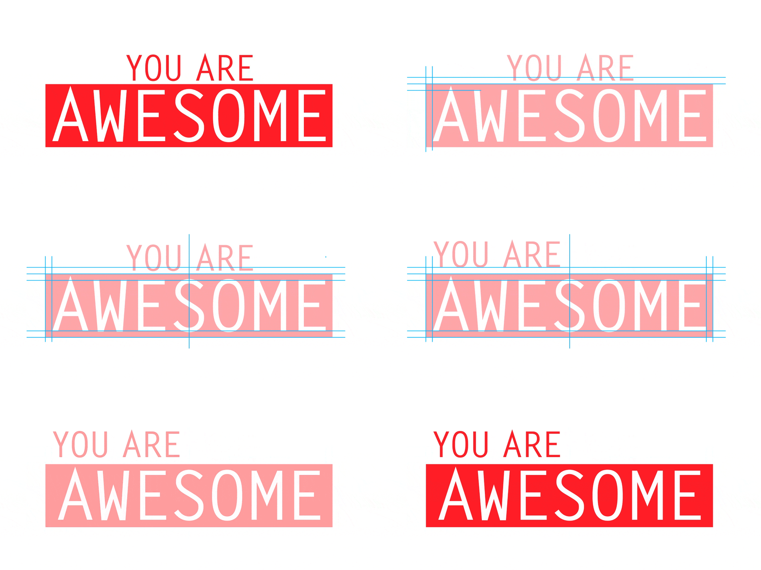
Why alignment matters: When alignment is clean, viewers don’t notice it – the design simply feels professional and ordered. When alignment breaks, viewers feel a vague discomfort without being able to name why. That friction erodes trust in your design.
Key rules:
- Align to a consistent edge – if your headlines align left, your body text aligns left, your captions align left
- Use a baseline grid for multi-column typography so text lines up horizontally across columns
- Center alignment works for short headlines and display type – avoid centering long body text
- Even in intentionally chaotic designs, there must be an underlying order to the chaos
However, this is similar to what you see in all books or magazines. Grids and alignment give structure to the design and the text. Thus, it makes the final image look more organized.
8. Framing
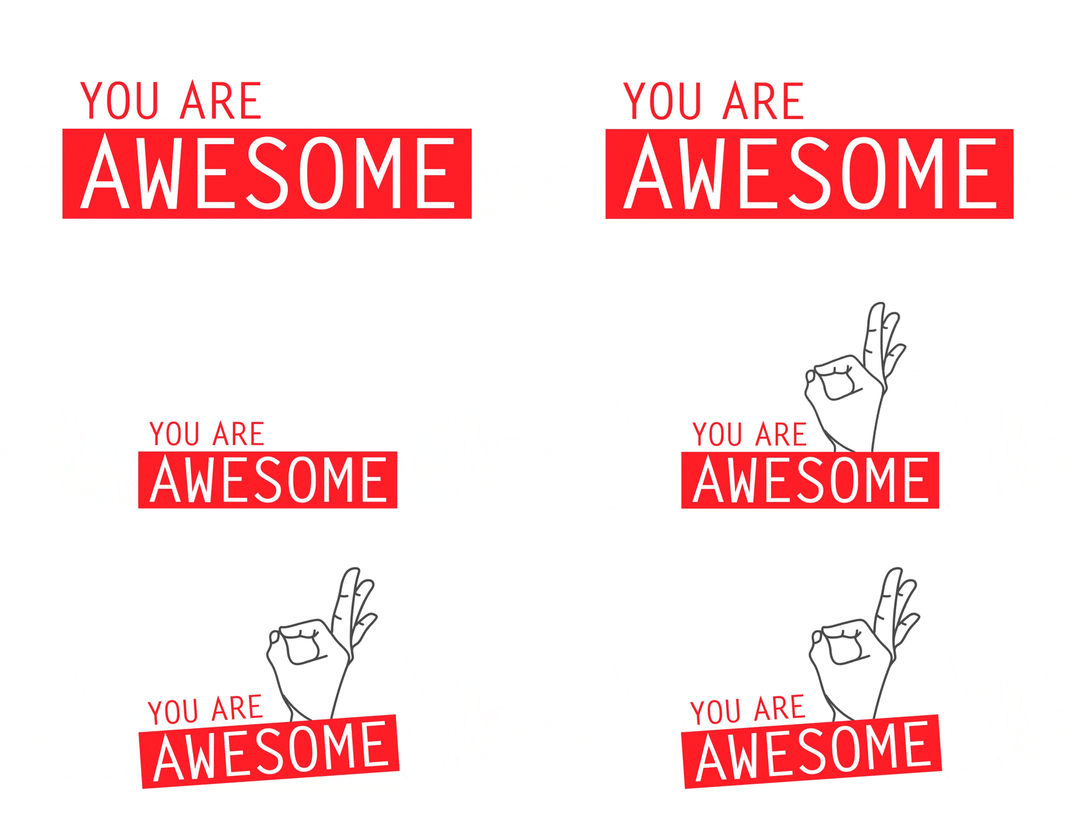
Framing is a principle borrowed from photography that applies equally to all visual design. It means using compositional choices – cropping, borders, surrounding elements – to direct the viewer’s eye toward what matters most.
How you frame an element determines what story it tells. The same photograph cropped three different ways can communicate three completely different emotions. The same product shown in different contexts signals completely different brand values.
Framing techniques in design:
- Crop tightly on a subject to create intensity and focus
- Pull back to show context and environment – useful when the setting matters to the message
- Use surrounding elements as natural frames – architectural elements, hands, doorways – to draw the eye inward
- Direct attention with leading lines – lines within an image or layout that guide the eye toward the focal point
The rule: Every framing decision should serve the story. Ask yourself: what do I want the viewer to notice first, and what framing choice will make that happen automatically?
9. Texture and Pattern
Texture and pattern are the finishing layer of visual design – not always necessary, but powerful when used well.
Texture adds a tactile, dimensional quality to otherwise flat design. It makes things feel physical and crafted. In print design, texture extends beyond the screen: paper stock, embossing, spot UV varnish, and foil stamping are all forms of texture that can elevate a design from ordinary to unforgettable. only as and when required.
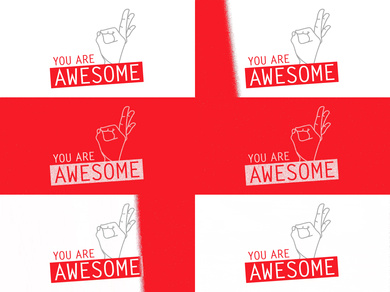
Pattern is about repetition – repeated visual elements that create rhythm, movement, and dynamism. Patterns fill space without adding noise, and they can carry brand personality efficiently across large surfaces like packaging, backgrounds, and environmental design.
When to use them:
- When a design feels too flat or sterile and needs warmth or personality
- When you have large areas of negative space that feel unfinished rather than intentional
- When brand guidelines call for a distinctive surface treatment
When not to use them:
- When they compete with the primary message
- When they reduce readability of text placed over them
- When they’re added just to fill space rather than to serve the design
Overdoing things may at times lead to a chaos. So, it is advisable to choose minimal special finishings.
10. Visual Concept
This is the most important principle on the list – and the hardest to teach.
A visual concept is the central idea that connects and justifies every decision in your design. It is the answer to the question: why does this design look the way it does?
Every color choice, every typeface, every compositional decision should trace back to a single unifying concept. When that thread exists, a design feels inevitable – like it couldn’t have been any other way. When it doesn’t, a design looks like a collection of random attractive decisions.

This is what separates a great designer from a competent one. Competent designers make good-looking choices. Great designers make good-looking choices that all mean something together.
How to develop a visual concept:
- Start with the brief – who is this for, what do they need to feel, what action should it drive?
- Identify the single most important thing the design needs to communicate
- Make every visual decision in service of that one thing
- If a design element can’t be justified by the concept, remove it
The longevity test: A design built on a strong concept ages well. A design built on current trends expires with them. The best logos, posters, and brand identities in history all have a concept you can articulate in one sentence.
Quick Reference
| Principle | What It Does | Watch Out For |
|---|---|---|
| Point, Line, Shape | Builds everything from basic geometry | Overcomplicating what can be simple |
| Color | Communicates emotion and meaning | Choosing colors you like over colors that work |
| Typography | Sets tone, hierarchy, and readability | Using too many typefaces |
| Negative Space | Creates breathing room and focus | Filling every empty space |
| Balance | Creates stability and visual weight | Ignoring asymmetrical balance options |
| Scale | Creates hierarchy and rhythm | Making everything the same size |
| Alignment & Grid | Creates order and professionalism | Random placement without structure |
| Framing | Directs attention to what matters | Cropping without purpose |
| Texture & Pattern | Adds dimension and personality | Using texture to fill space, not serve the design |
| Visual Concept | Connects and justifies every decision | Making attractive choices with no unifying idea |
FAQ
The 10 principles of visual design are: point, line, and shape; color; typography; negative space; balance; scale; alignment and grid; framing; texture and pattern; and visual concept. Together they govern how design elements are arranged to communicate effectively.
Visual concept is arguably the most important because it gives meaning and purpose to every other decision. Without a strong concept, a design can be technically correct but feel empty. Visual hierarchy is the most important for readability and communication clarity.
Negative space is the empty area in and around design elements. It is an active design tool – not wasted space. It improves readability, creates a premium feel, and can define shapes and meaning on its own, as in the FedEx arrow hidden between letterforms.
Balance refers to the distribution of visual weight across a composition – making sure no single area feels too heavy or too light. Alignment refers to the positioning of elements relative to each other and to a grid – ensuring nothing is placed arbitrarily.
Scale communicates importance through size. Larger elements are perceived as more important and get noticed first. A strong size hierarchy – dramatic differences between headline, subheading, and body text sizes – guides the viewer through content in an intentional order.
A visual concept is the central idea that connects and justifies every design decision. It answers why the design looks the way it does. A strong visual concept makes every color, typeface, and compositional choice feel inevitable rather than arbitrary.
Typography is a principle because how text looks changes how it communicates. The right typeface reinforces a message; the wrong one undermines it. Typography controls tone, readability, hierarchy, and brand personality – making it one of the most powerful tools in a designer’s toolkit.
Don’t Miss
- How to Design a Perfect Business Logo: Complete Guide
- Color Psychology in Film: How Directors Use Color to Tell Stories
- 10 Types of Graphic Designers: Which One Are You?
- Best AI Tools for Graphic Designers in 2026
Original framework and images by designer José Torre. This article expands on his 10 principles with additional examples and context for designers.
Don't Miss

Graphic Design The 6 Principles of Design
Religiously We Should Follow These 7 Logo Design Principles

Contrast in King : 7 Principles of Typographic Contrast

What Makes Good Design? Basic Elements and Principles of Design
18 Rules for Using Text for Designing
