
Color Psychology in Design: What Every Color Says About Your Brand
Color psychology in design is one of the most misunderstood tools in branding. Most designers know that red feels urgent and blue feels calm. However, knowing a color’s general meaning and knowing how to apply it strategically in a brand identity are two completely different skills. Get it right, and your color choice reinforces everything your brand stands for. Get it wrong, and your brand sends a message you never intended.
Because color is processed before language, it shapes how people feel about a brand before they read a single word. Furthermore, research consistently shows that color increases brand recognition by up to 80 percent. That is not a small margin. In a crowded market, it is often the difference between being remembered and being ignored.
This guide breaks down the color psychology in design that actually matters – not just what each color generally means, but what it communicates specifically in a branding and design context, which brands use it and why, and how to make smarter color decisions for your own projects.
At a Glance: Color psychology in design is the study of how colors influence human perception and behavior. Red creates urgency and energy. Blue builds trust and professionalism. Green signals nature and growth. Yellow grabs attention. Black communicates luxury. White suggests simplicity. Every color choice in a brand identity sends a psychological message to the audience – intentionally or not.
More Color Guides on CGfrog:
- Color Psychology in Film: How Directors Use Color to Tell Stories
- Shades of Blue: 100+ Blue Color Names with HEX and RGB Codes
- Shades of Green: 100+ Green Color Names with HEX and RGB Codes
- Shades of Red: 100+ Red Color Names with HEX and RGB Codes
- 15 Best Color Combinations for Logo Design
The Color Psychology Infographic Every Designer Should Know
Before diving into each color in detail, the infographic below – created by Tech King and Kissmetrics – gives a solid overview of how color psychology applies across industries and contexts. It is one of the most widely referenced visual breakdowns of this topic in design circles.
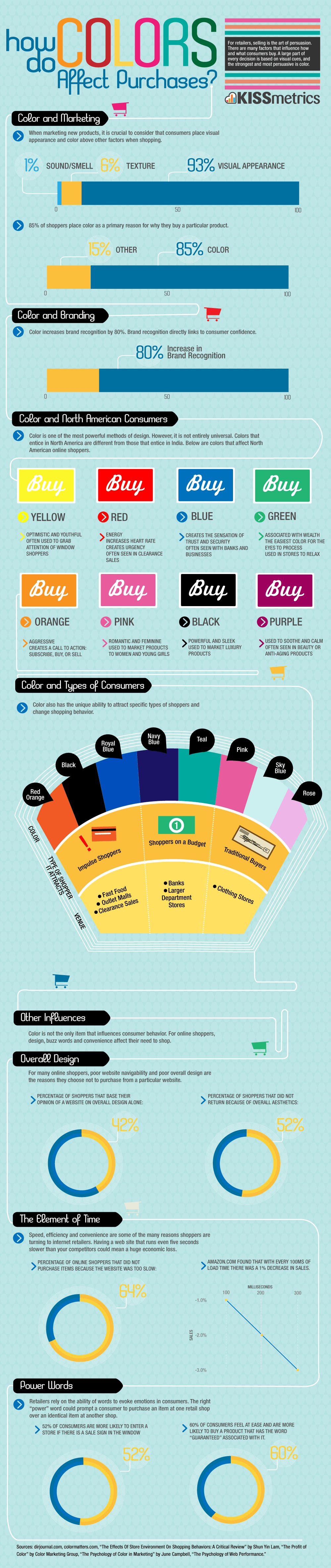
However, an infographic can only go so far. Because real color psychology in design is about context and application – not just associations – the sections below go deeper into what each color actually communicates in a brand setting, with real examples from globally recognized brands.
Color Psychology in Design: What Each Color Communicates
Red in Design – Energy, Urgency, and Appetite
Red is the most attention-grabbing color in the spectrum. Because it triggers physical arousal – increasing heart rate and creating a sense of urgency – it is used strategically in contexts where immediate action matters. Furthermore, red stimulates appetite, which is why it dominates the food and restaurant industry.
What red communicates in branding:
- Energy, excitement, and passion
- Urgency – sales, clearance, limited time offers
- Appetite and food associations
- Power and confidence
- Danger or warning in safety contexts
Brands that use red strategically: Coca-Cola chose red in the 1880s because it stood out on signs and created warmth. Netflix uses red to signal entertainment and excitement. YouTube’s red play button is one of the most recognized icons in the world. Target uses red to create a bold, energetic retail experience. Similarly, Red Bull’s red communicates the energy the product promises.
When to use red: Food, retail, entertainment, sports, and energy brands. Also effective for CTAs and sale announcements. However, avoid red in finance, healthcare, or luxury contexts where it can feel aggressive or alarming.
For the full range of red shades with exact HEX codes, see our complete guide to shades of red.
Blue in Design – Trust, Professionalism, and Calm
Blue is the most universally preferred color across cultures and demographics. Because it is associated with sky and water – two constants in human experience – it communicates stability, reliability, and calm. Furthermore, blue is the dominant color in finance, tech, and healthcare for a simple reason: it builds trust faster than any other color.
What blue communicates in branding:
- Trust, reliability, and credibility
- Professionalism and authority
- Calm and security
- Intelligence and logic
- Loyalty and dependability
Brands that use blue strategically: Facebook chose blue partly because founder Mark Zuckerberg is red-green colorblind – but it also communicates the trust and connection the platform needs. Samsung, Ford, PayPal, LinkedIn, and American Express all rely on blue to signal professionalism. In healthcare, blue is used almost universally because it reduces anxiety.
When to use blue: Finance, technology, healthcare, corporate services, and social platforms. Additionally, blue works well for any brand that needs to communicate expertise or dependability. However, avoid blue for food brands – it suppresses appetite.
Explore our complete guide to shades of blue for exact HEX and RGB codes across 100+ blue tones.
Green in Design – Nature, Health, and Growth
Green sits at the center of the visible spectrum, which is why human eyes process it with less strain than other colors. Because of its natural associations with plants, trees, and open spaces, green communicates health, freshness, and environmental responsibility. Furthermore, in financial contexts, green carries strong associations with money, growth, and prosperity.
What green communicates in branding:
- Nature, sustainability, and environmental responsibility
- Health, wellness, and organic products
- Growth, prosperity, and financial success
- Freshness and vitality
- Safety and permission
Brands that use green strategically: Starbucks uses green to communicate its premium, natural positioning and to signal a calm, welcoming environment. Whole Foods uses green to reinforce its organic and natural brand promise. Spotify’s bright green communicates energy and freshness. John Deere’s dark green has become inseparable from agricultural heritage. Similarly, Animal Planet uses green to signal its connection to the natural world.
When to use green: Food, wellness, environmental, financial, and outdoor brands. However, the specific shade matters enormously – dark greens communicate sophistication and heritage, while bright greens signal energy and freshness. See our complete guide to shades of green for the right tone for your project.
Yellow in Design – Optimism, Warmth, and Attention
Yellow is the most visible color in daylight, which is why it is used for warning signs, taxis, and school buses. In branding, yellow communicates optimism, warmth, and accessibility. However, it is also one of the most difficult colors to use effectively – too much yellow creates anxiety, and it can read as cheap if not handled carefully.
What yellow communicates in branding:
- Optimism, happiness, and positivity
- Energy and warmth
- Affordability and value
- Creativity and intellectual stimulation
- Caution or urgency in safety contexts
Brands that use yellow strategically: McDonald’s Golden Arches are yellow because the color stimulates appetite and creates a feeling of happiness and speed. IKEA uses yellow and blue to communicate affordability and accessibility. Snapchat’s yellow signals youth, fun, and energy. Furthermore, Caterpillar uses yellow to communicate visibility and reliability in industrial contexts.
When to use yellow: Food, retail, children’s brands, and budget-friendly services. Additionally, yellow works well as an accent color to draw attention to specific elements. However, use it sparingly as a primary brand color – it rarely works at large scale.
Black in Design – Luxury, Sophistication, and Authority
Black communicates more premium associations than any other color. Because it absorbs all light and reveals nothing, black suggests mystery, exclusivity, and power. Furthermore, in luxury branding, black is the default choice precisely because it communicates that less needs to be said.
What black communicates in branding:
- Luxury, premium quality, and exclusivity
- Sophistication and elegance
- Authority and power
- Timelessness and classic appeal
- Mystery and intrigue
Brands that use black strategically: Chanel, Prada, and Gucci all rely on black to communicate luxury without explanation. Apple’s black packaging and product design signals premium quality. Nike’s black swoosh on white communicates clean athletic power. Similarly, Spotify uses black as a canvas that makes its green accent feel more premium than it would on a white background.
When to use black: Luxury goods, fashion, technology, automotive, and high-end services. Additionally, black works well as a secondary color to add sophistication to any palette. However, be careful using black in healthcare or children’s branding – it can feel cold or intimidating.
White in Design – Simplicity, Cleanliness, and Space
White communicates clarity, cleanliness, and the absence of clutter. Because it reflects all light, white creates a sense of openness and breathing room. Furthermore, in design, white space is as important as color – it lets other elements communicate without competition.
What white communicates in branding:
- Cleanliness, purity, and hygiene
- Simplicity and minimalism
- Honesty and transparency
- Modernity and innovation
- Space and openness
Brands that use white strategically: Apple’s white packaging and product design signals simplicity and innovation simultaneously. Tesla uses white to communicate clean energy and modernity. Furthermore, most healthcare brands use white to signal clinical cleanliness and trustworthiness.
When to use white: Technology, healthcare, luxury, and minimalist brands. Also effective as a primary background color for any brand that wants its other elements to breathe. However, white alone rarely carries enough personality – it works best in combination with a strong accent color.
Orange in Design – Energy, Friendliness, and Affordability
Orange combines the energy of red with the optimism of yellow. As a result, it communicates enthusiasm, warmth, and approachability. Furthermore, orange sits in a unique position – it is energetic enough to grab attention but friendlier and less aggressive than red.
What orange communicates in branding:
- Energy, enthusiasm, and vitality
- Friendliness and accessibility
- Affordability and value
- Creativity and adventure
- Warmth and confidence
Brands that use orange strategically: Amazon uses orange in its smile logo to communicate friendliness and the joy of receiving a package. Harley-Davidson uses orange to signal adventure, freedom, and energy. Additionally, Fanta uses orange to communicate fun and youthful energy. Penguin Books has used orange since 1935 – it communicates accessibility and approachability in a way that says “books for everyone.”
When to use orange: Retail, food, sports, entertainment, and youth-focused brands. Additionally, orange works well for CTAs where you want to convey action without the aggression of red.
Purple in Design – Creativity, Wisdom, and Premium Quality
Purple was historically the most expensive dye to produce, which is why it became associated with royalty and luxury. Because of this heritage, purple still communicates premium quality and exclusivity in modern branding. Furthermore, its association with creativity and imagination makes it popular in beauty, wellness, and arts sectors.
What purple communicates in branding:
- Luxury, royalty, and premium quality
- Creativity, imagination, and mystery
- Wisdom, spirituality, and depth
- Femininity in certain contexts
- Innovation and forward-thinking
Brands that use purple strategically: Cadbury uses purple to signal premium chocolate – it has become so associated with the brand that they have legally protected it. Hallmark uses purple to communicate sentimentality and quality. Similarly, FedEx uses purple alongside orange to communicate reliability and speed.
When to use purple: Beauty, wellness, luxury goods, creative industries, and spirituality brands. Additionally, purple works well for technology brands that want to signal innovation rather than corporate reliability.

The Color Psychology Mistakes Most Brands Make
Understanding what colors mean is only half the job. The other half is avoiding the mistakes that undermine an otherwise good color choice.
Mistake 1: Choosing a Color You Like Instead of One Your Audience Responds To
This is the most common mistake in brand color selection. Your personal preference for a color is irrelevant if your target audience responds differently. A founder who loves orange does not automatically mean orange is right for a luxury financial services firm. The color needs to work for the audience, not for the designer or the client.
Mistake 2: Ignoring Cultural Color Differences
Color associations are not universal. White communicates mourning in several Asian cultures. Green has religious significance in Islamic contexts. Red means luck in China but danger in most Western markets. Furthermore, if your brand operates across multiple markets, these differences need to be factored into color decisions. A color that works perfectly in one market can create serious problems in another.
Mistake 3: Using Too Many Colors
Every additional color in a brand palette adds complexity and reduces memorability. The strongest brand color identities use one or two dominant colors. Additionally, a palette that works in one application will break down when applied consistently across every brand touchpoint if it contains too many competing hues.
Mistake 4: Following Trends Instead of Strategy
Color trends in branding come and go. Millennial pink dominated brand design for several years and now reads as dated. Similarly, the gradient trend has already started to feel dated in some contexts. Because a brand identity needs to last five to ten years, trend-driven color choices create expensive redesign cycles. Strategy-driven color choices age far better.
How to Choose the Right Color for Your Brand
Because color decisions have long-term consequences, they deserve more thought than most early-stage brands give them. A useful framework for color selection involves four steps.
First, define your brand personality in words before thinking about color at all. If your brand were a person, how would you describe them? The words you use will point toward a color family more reliably than browsing palettes.
Second, research your competitors’ color choices. If every competitor in your category uses blue, there is both a reason for that – blue builds trust – and an opportunity. Standing out with a different color can create differentiation, as long as the new color still communicates something true about the brand.
Third, test your shortlisted colors with actual members of your target audience. Color perception is not universal – what feels premium to one demographic can feel cold to another.
Fourth, test the color in context. A brand color that looks beautiful on a white background may become muddy on packaging, difficult to read on a dark background, or fail entirely when reproduced in one color for embroidery or stamping.
Need help choosing the right colors for your brand identity? Color decisions in logo design have long-term consequences – and getting them wrong is expensive to fix. CGfrog has been building color-strategic brand identities for over 14 years. Our team handles everything from color research to final logo files, with unlimited revisions and full copyright transfer. Packages start from $39.99. View CGfrog logo design packages →
Recommended Resources
Looking for professional color palette assets and brand identity templates? Envato Elements gives you unlimited access to color palettes, brand identity kits, and design assets under one subscription.
For individual color-focused design assets from independent designers, Creative Market has an excellent collection of brand identity resources and color palette tools.
If your project needs a professional logo built around a strategic color choice, 99designs connects you with vetted designers for brand identity work at every budget level.
FAQ
Color psychology in design is the study of how colors influence human perception, emotion, and behavior in visual communication and branding contexts. Because color is processed before language, it shapes how audiences feel about a brand before they read a single word. Every color carries associations – built through biology, culture, and experience – that designers use intentionally to communicate specific messages.
There is no single most important color – the right color depends entirely on the brand’s audience, values, and market position. However, blue is the most widely used color in corporate branding because it consistently communicates trust and reliability across cultures and demographics. Red is the most attention-grabbing. Black signals the highest premium associations. The most important color for any specific brand is the one that most accurately reflects its personality and resonates with its target audience.
Yes – research consistently shows that color influences purchasing decisions significantly. Studies suggest that up to 85 percent of consumers cite color as a primary reason for buying a product, and that color increases brand recognition by up to 80 percent. Furthermore, color affects perceived value – products in premium-looking color combinations are consistently judged as higher quality than the same product in generic packaging, even when the product itself is identical.
Blue became dominant in tech branding because it communicates trust, reliability, and intelligence – qualities that early technology companies needed to establish credibility with skeptical consumers. Additionally, blue has no significant negative cultural associations in Western markets, making it a safe choice for global brands. Facebook, Samsung, Dell, HP, Intel, PayPal, and LinkedIn all use blue for these reasons. However, newer tech brands increasingly avoid blue precisely because it has become so associated with established players – standing out requires a different color choice.
Yes, but with discipline. The strongest brand identities typically use one dominant color supported by one or two secondary colors. Google and NBC use multiple colors intentionally to signal diversity and range. However, for most brands – especially small businesses and startups – a focused palette of one or two colors builds recognition faster and applies more consistently across all brand touchpoints. Every additional color adds complexity and reduces memorability.
No color is universally wrong for a logo – context determines everything. However, some practical considerations apply broadly. Yellow is difficult to use as a primary logo color because it reads poorly on white backgrounds and can feel cheap at large scale. Very light colors create legibility problems in many applications. Trendy color combinations date quickly and require expensive rebranding. Furthermore, colors that match your competitors’ identities too closely create confusion and undermine differentiation.
Color associations vary significantly across cultures. White signals mourning in several Asian cultures but purity in Western contexts. Green carries religious significance in Islamic cultures. Red means luck and prosperity in China but danger in many Western markets. Purple signals mourning in some Latin American cultures. Because these differences are real and consequential, brands operating across multiple markets need to research color associations in each specific market before finalizing a global brand palette.
Don't Miss
Shades of Green: 100+ Green Color Names with HEX & RGB Codes
Shades of Blue: 100+ Blue Color Names with HEX & RGB Codes

Color Psychology in Film: How Directors Use Color to Tell Stories
It’s Bubblegum, Not ‘Light Pink’: The Ultimate Color Thesaurus for Every Imagineable Shade
15 Best Color Combinations for Logo Design (With HEX Codes & Examples)
