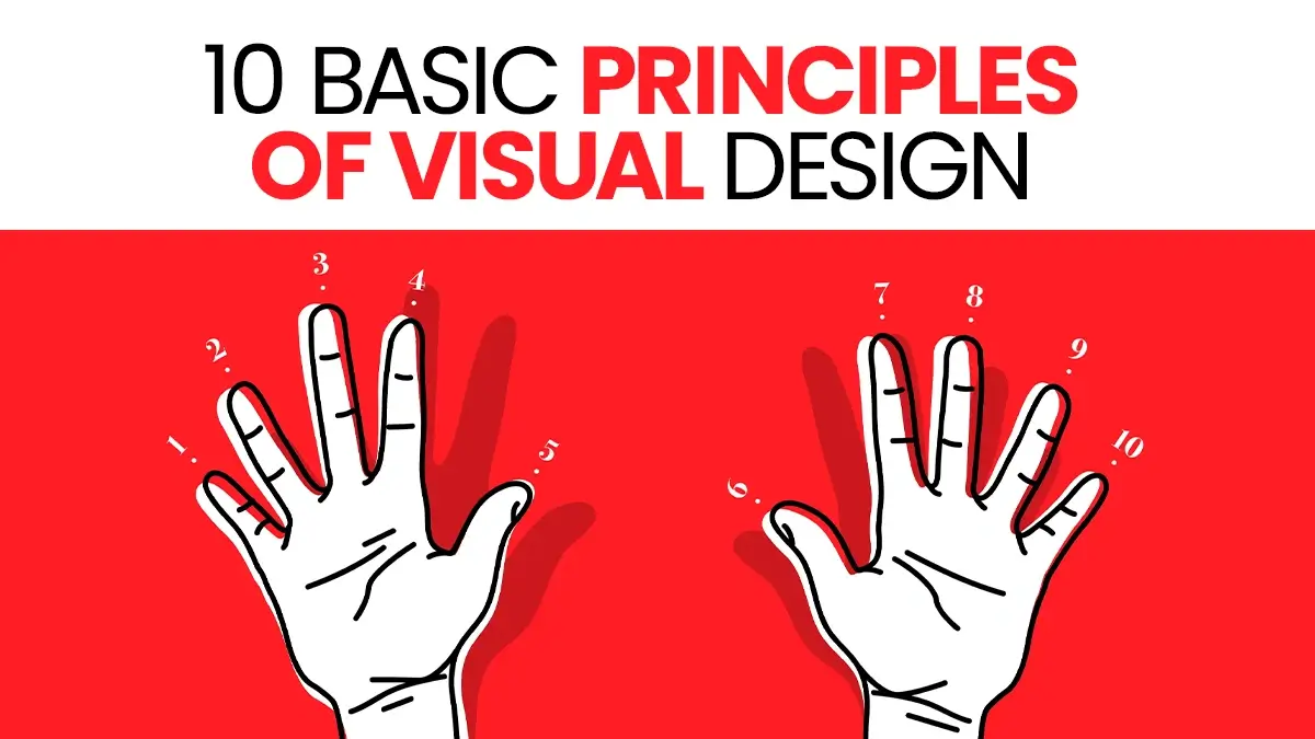
Y2K Aesthetic vs Neo-Brutalism: Which Trend is Winning in 2026?
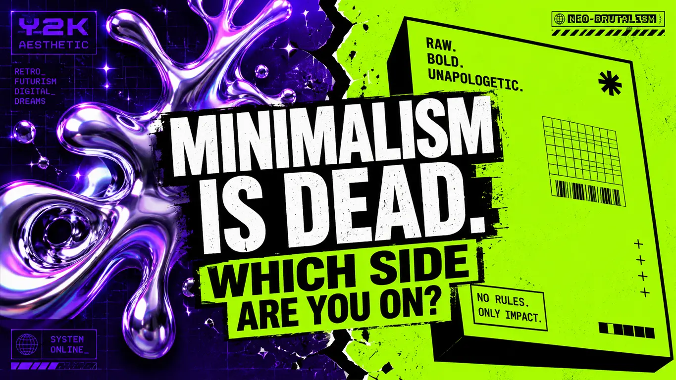
Let’s stop pretending. The era of clean, sterile, corporate minimalism is officially dead. Today, a massive Y2K vs Neo-Brutalism web design battle is raging between two unapologetic subcultures.
Right now, a massive design proxy war is raging between two unapologetic subcultures: Y2K Aesthetic and Neo-Brutalism. One feeds on pure human nostalgia; the other thrives on raw, structural chaos.
If you want your portfolio to survive the agency review cycle, you need to understand exactly which trend to deploy, when to use it, and which one is winning the battle for high-converting CTRs.
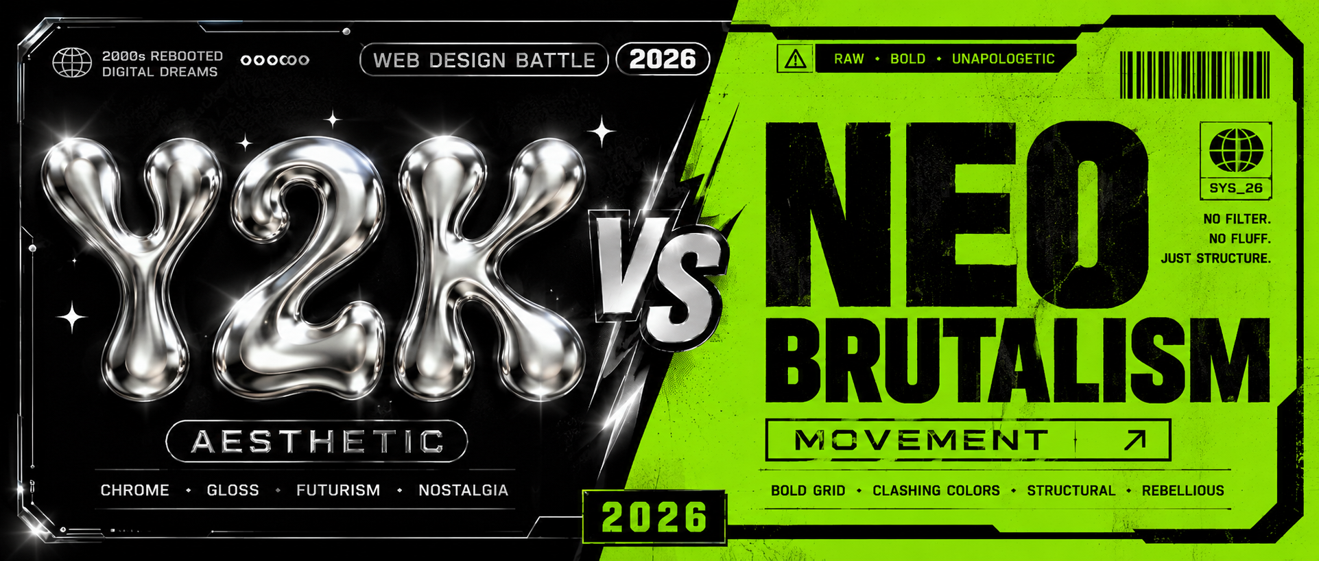
The Y2K Vs Neo-Brutalism Battle: Cyber-Punk Nostalgia
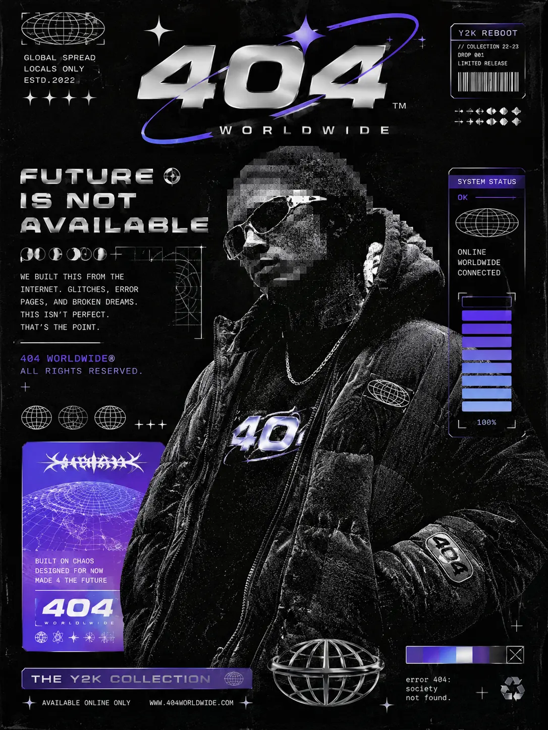
The late-90s and early-2000s tech-optimism is back with a vengeance. The Y2K aesthetic is a deliberate rejection of flat, overly polished vector art. It embraces the early internet era’s beautiful imperfections.
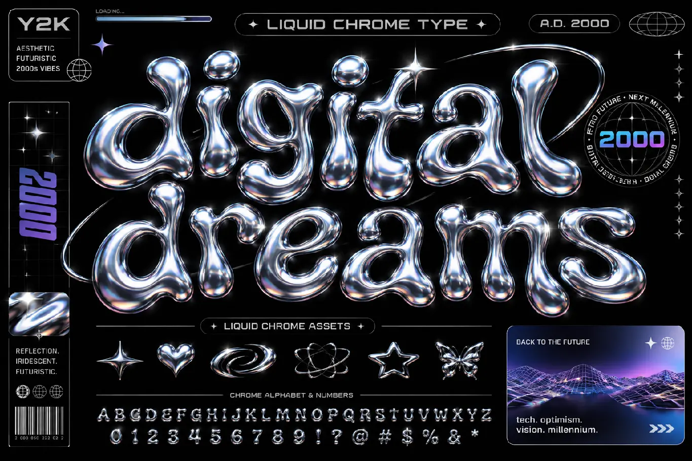
The Vibe: Iridescent liquid chrome, chunky low-poly 3D models, glitch art, matrix-style cyber grids, and sci-fi tech interfaces.
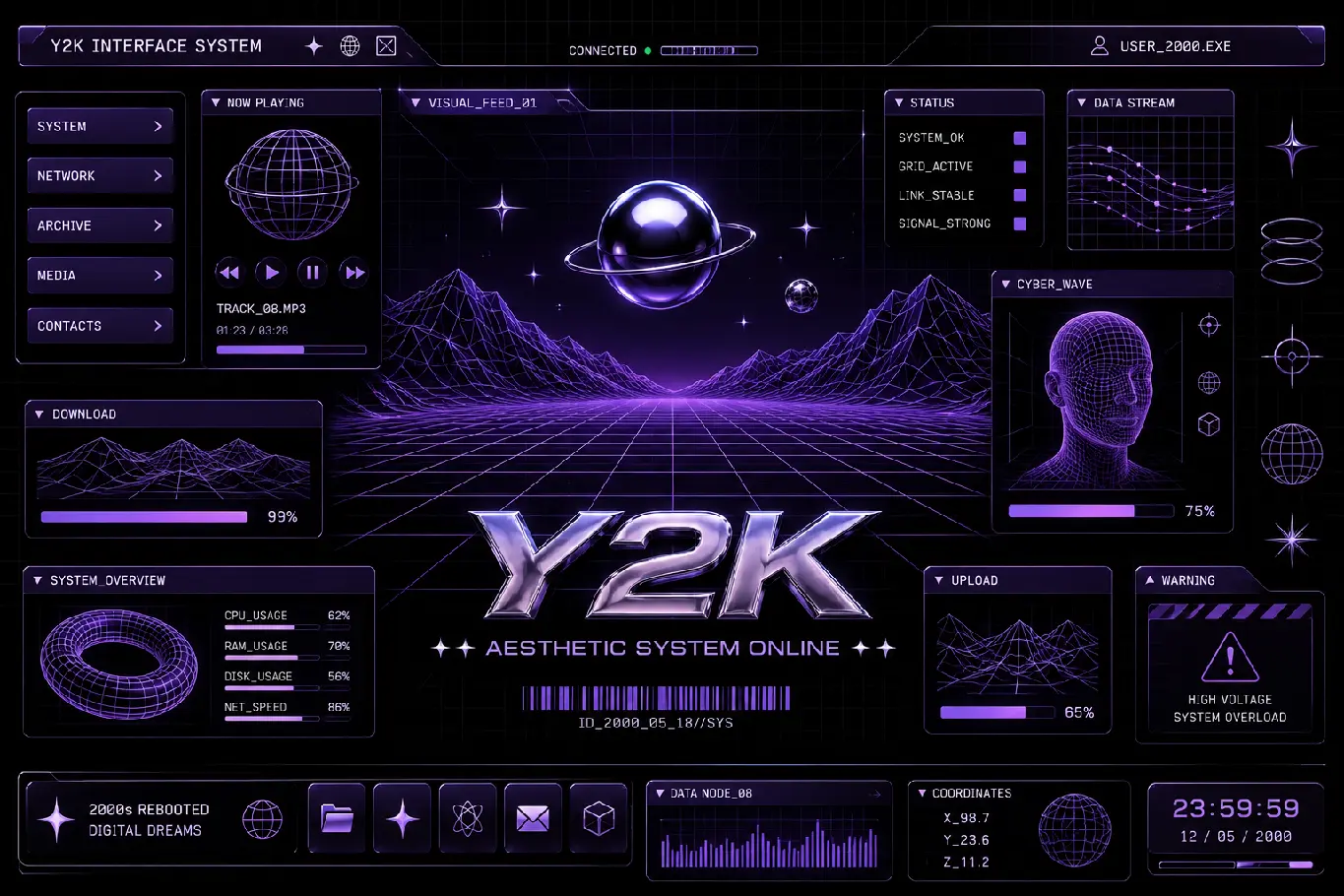
Why It Captivates the US Market: Consumers are suffering from severe AI-generated design fatigue. Y2K feels raw, human, and delightfully chaotic. It triggers an instant dopamine hit of nostalgia for creative buyers.
Best Use Cases: High-end streetwear branding, vinyl record covers, gaming landing pages, and attention-grabbing social media campaigns.
Whether you are rendering fluid chrome or adding intentional digital grit, leveraging the best AI tools for graphic designers will cut your execution time in half.
2. Neo-Brutalism: The Raw, No-Nonsense Web Dictator
If Y2K is a chaotic rave, Neo-Brutalism is a concrete fist. Heavily inspired by architectural brutalism, this trend completely strips away the fake friendliness of modern UX/UI design.
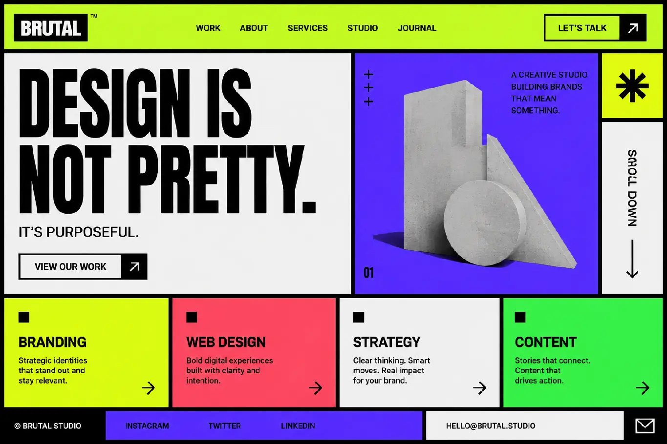
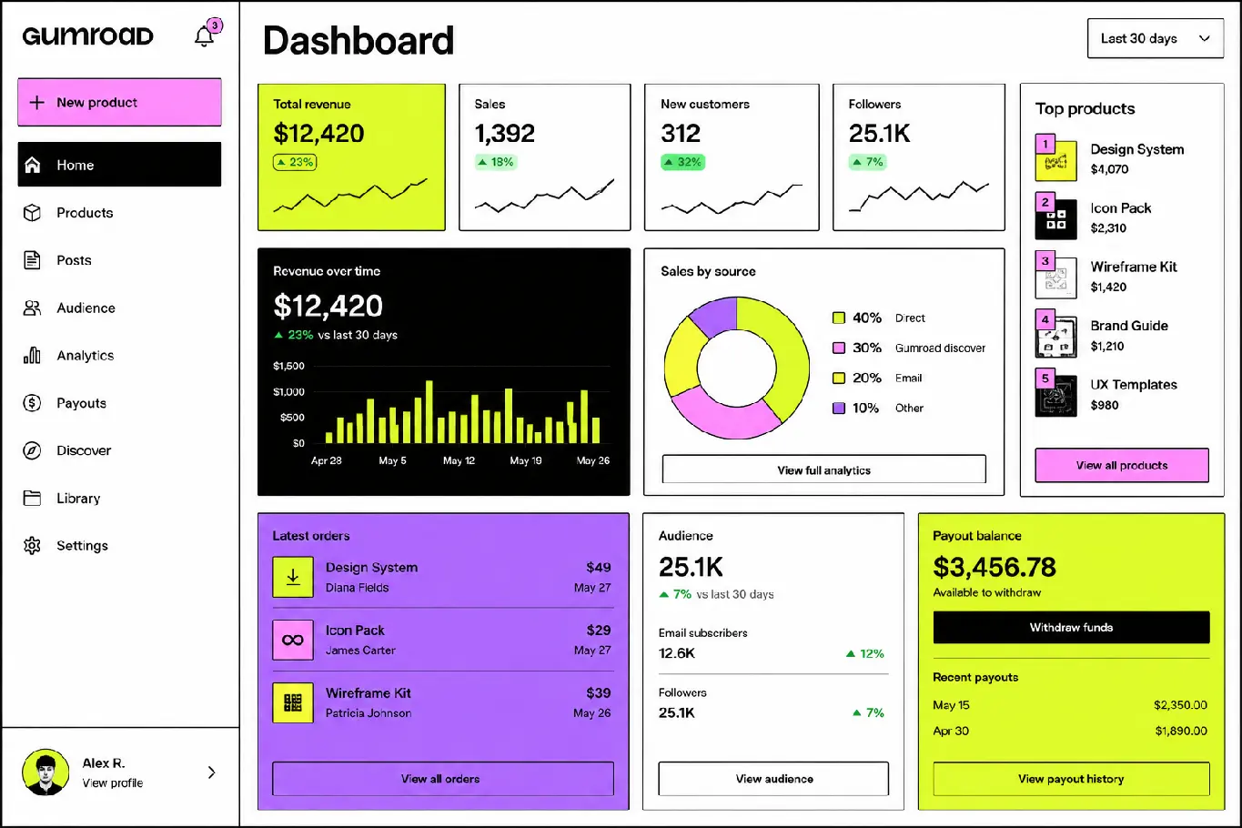
The Vibe: Thick, unapologetic black borders (#000000), hard-edged geometric shapes, asymmetrical layouts, and zero background blurs. It favors high-saturation neon backdrops—including our signature vibrant green (#76ff03).
Why It Captivates the US Market: Industry giants like Figma, Gumroad, and cutting-edge fintech startups have weaponized Neo-Brutalism. It converts incredibly well because it forces the user’s eye straight to the content without hiding behind soft shadows or gradient fluff.
Best Use Cases: Modern B2B SaaS platforms, hyper-growth web apps, and cutting-edge freelancer portfolios that need to cut through the noise.
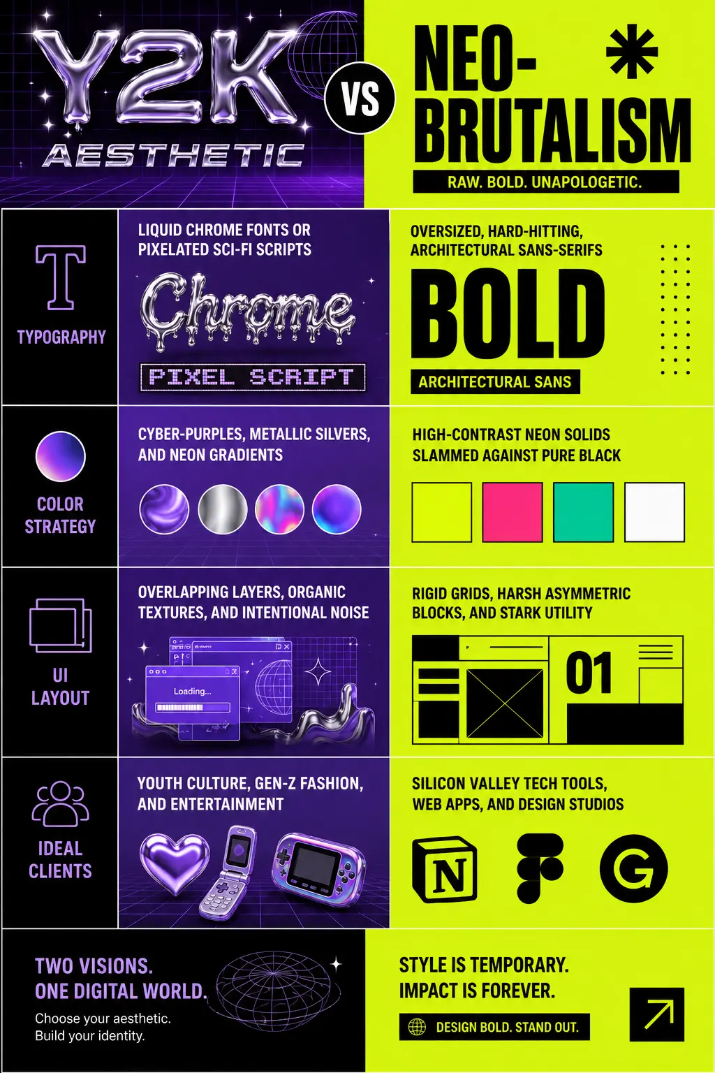
Direct Breakdown: Y2K vs Neo-Brutalism Web Design
To help busy creative directors scan this piece in under 10 seconds during their morning coffee break, we have broken down the core anatomy of both movements:
| Design Pillar | Y2K Aesthetic | Neo-Brutalism |
|---|---|---|
| Typography | Liquid chrome fonts or pixelated sci-fi scripts | Oversized, hard-hitting, architectural Sans-Serifs |
| Color Strategy | Cyber-purples, metallic silvers, and neon gradients | High-contrast neon solids slammed against pure black |
| UI Layout | Overlapping layers, organic textures, and intentional noise | Rigid grids, harsh asymmetric blocks, and stark utility |
| Ideal Clients | Youth culture, Gen-Z fashion, and entertainment | Silicon Valley tech tools, web apps, and design studios |
Pro-Tip for Elite Designers: Never pitch Neo-Brutalism to a conservative corporate client; they will think your CSS failed to load. Use it exclusively for tech startups and forward-thinking web apps. For inspiration on world-class implementation, review the Nielsen Norman Group’s breakdown on Neo-Brutalism ergonomics.
Looking to level up your foundational skills before picking a trend? Check out our list of 5 + 1 Free Classic Ebooks Every Graphic Designer Must Read.
FAQs
Neo-Brutalism generally outperforms Y2K in direct conversion rates (CTR) for SaaS and digital products. Its high contrast, ultra-clear visual hierarchy, and massive call-to-action buttons eliminate user confusion, making it highly effective for conversions.
es, but with caution. You can overlay Y2K elements like liquid chrome assets or low-poly 3D graphics on top of a rigid, high-contrast Neo-Brutalism layout grid. This hybrid style works exceptionally well for youth-centric streetwear and Web3 brands.
Absolutely. Neo-Brutalism uses flat geometric blocks and eliminates heavy shadows and drop blurs. This raw structure makes mobile web apps load faster and renders exceptionally well on small screens, leading to cleaner navigation.
American agencies are facing severe “AI-generated design fatigue” where every corporate landing page looks identical. Bold subcultures like Y2K and Neo-Brutalism offer immediate human thumb-stopping power on social feeds and make portfolios stand out during competitive review cycles.
Don't Miss
Google’s Massive 2026 Icon Redesign Leaked: The End of the Four-Color Era?
Top Logo Design Trends 2026 (With Real Brand Examples You Should Know)
Top Graphic Design Trends in 2025
Top 9 Logo Design Trends of 2021
New: Top 8 Graphic Design Trends 2019