Google’s Massive 2026 Icon Redesign Leaked: The End of the Four-Color Era?
In 2026, Google is once again redefining its visual identity. Leaked reports suggest that the tech giant is moving away from the flat, four-color icons that have defined the Workspace suite for years. The new direction? Vibrant Gradients and Rounded Geometries.
This strategic shift toward an “AI-First” aesthetic aligns the Workspace apps with the look and feel of Google’s AI, powered by the Gemini family of models. Here is a detailed, icon-by-icon breakdown of what could be the biggest Google redesign in a decade.
According to a recent report by 9to5Google, the tech giant is currently testing a radical new gradient-style look for its Workspace suite…
At a Glance: Old vs New Google Icons Comparison (2026)
| App Name | Most Searched Keyword | 2026 Design Change Summary |
|---|---|---|
| Gmail | New Gmail Logo | Rounded ‘M’ with Vibrant Red Gradient |
| Google Drive | Google Drive Icon Update | Symmetrical 3-color Palette (Red Removed) |
| Google Calendar | Google Calendar New Logo | 3D Skeuomorphic Flip-Style Design |
| Google Meet | Google Meet New Icon | High-Visibility Yellow-Orange Gradient |
| Google Docs | Google Docs Redesign | Translucent Glassmorphism with Blue Glow |
| Google Sheets | New Google Sheets Logo | Radical Horizontal Tab Design (Green) |
| Google Slides | New Google Slides Logo | Layered Horizontal Deck Layout (Yellow) |
| Google Chat | Google Chat Redesign 2026 | Pill-shaped Bubble with Friendly Smile |
| Google Tasks | New Google Tasks Logo | Solid Blue Circle with 3D Depth |
| Google Keep | Google Keep Redesign 2026 | Glowing Lightbulb Silhouette (Radiant Yellow) |
| Google Voice | New Google Voice Logo | Fluid Teal-Green Gradient and Rounded UI |
| Google Forms | New Google Forms Logo | Deconstructed Floating Data Elements (Purple) |
| Google Sites | New Google Sites Logo | Modern Browser Window Frame (Blue) |
The 2026 Google Workspace Icon Redesign: A Detailed Analysis
1. Gmail: The Vibrant Gradient Evolution (2026)
The Design Analysis
The new Gmail icon is a significant change from the flat, segmented color blocks of the previous version. While the iconic ‘M’ shape remains, the execution has shifted toward Fluid Gradients.
- Color Transition: Instead of sharp lines separating Blue, Red, Yellow, and Green, the new logo uses soft, glowing transitions. Notice the pinkish-red hue on the top-left and the lime-green to deep-blue blend on the right.
- Visual Depth: The use of gradients creates a subtle 3D effect, making the icon look more “Glassmorphic” and modern. It aligns perfectly with the aesthetic of Google Gemini AI.
- Rounding: The corners are slightly softer, giving it a more approachable and “Friendly” feel compared to the stark geometry of the old logo.
The “Why” (Design Logic)
Google is solving the “Sameness” problem. By making the colors more vibrant and glowing, Gmail stands out more distinctly on high-resolution smartphone displays and OLED screens. It signals that Gmail is no longer just an email client but an AI-powered communication hub.
New Gmail Logo 2026 vs Old: A Side-by-Side Comparison
2. Google Drive: The Death of the Red Accent (2026)
The Design Analysis
The Google Drive Icon Update gives the logo a softer, more balanced, and more symmetrical appearance than before. Instead of the older flat color blocks, the New Google Drive Logo uses vibrant gradients that feel more modern and polished.
- Removal of Red: The biggest change in the Drive Redesign 2026 is the removal of the red color from the bottom-right section. The icon is now dominated by blue, green, and yellow tones.
- Soft Gradients: In the previous version, where colors blended together, there were harder shadow transitions. The updated design introduces glowing gradients that make the corners feel more rounded and organic.
- Central Triangle: The white space in the center now looks cleaner and more balanced, helping reinforce a sense of storage, organization, and trust.
The “Why” (Design Logic)
Google likely removed red to create better color harmony between Drive and its companion apps—Docs, Sheets, and Slides—since those products do not prominently use red. This redesign also reflects modern glassmorphism-inspired trends, giving the app a faster, smarter, and more AI-integrated feel while strengthening the overall Google Workspace Brand Identity.
New Google Drive Logo 2026 vs Old: A Side-by-Side Comparison
3. Google Calendar: The Return of the “Flip-Style” Icon (2026)
The Design Analysis
The Google Calendar Icon Change represents a major visual shift. Instead of the older flat square design, the New Google Calendar Logo now looks more like a three-dimensional physical object.
- Skeuomorphic Touch: Google has replaced the old flat box style with a “flip calendar” shape. At the top, there is a translucent blue tab that resembles classic desk calendars, adding a nostalgic yet modern touch.
- Monochromatic Blue: The biggest update in the Calendar Redesign 2026 is the complete removal of green, yellow, and red. The icon now uses only different shades of blue gradients for a cleaner and more focused identity.
- Typography: The number “31” in the center is now larger, bolder, and easier to read, improving visibility and quick date recognition.
- Curvature: The icon’s edges are no longer sharp and rigid. Instead, they appear slightly pinched and rounded, giving it a more modern, premium, and high-tech feel.
The “Why” (Design Logic)
Google likely made this change to improve instant recognition. Many users felt that Google’s app icons—such as Gmail, Drive, and Calendar—looked too similar. By giving Calendar a blue-only palette and a unique shape, Google is making it stand out more clearly on the home screen while strengthening the overall Google Workspace Icon Update strategy.
Google Calendar New Logo 2026 vs Old: Embracing Skeuomorphism
4. Google Meet: The High-Contrast Video Revolution (2026)
The Design Analysis
The Google Meet New Icon transforms the app from a multi-color camera symbol into a vibrant yellow-to-orange gradient powerhouse. The new look feels bolder, cleaner, and far more attention-grabbing.
- Bold Monochromatic Shift: Like Calendar, Meet has moved away from using all four Google colors and instead focuses on one dominant palette—yellow and orange. This makes the Google Meet Logo Redesign instantly noticeable on the home screen.
- The “Lens” Element: One key detail is the new white dot placed near the bottom of the icon. This represents a camera lens, helping the icon feel more recognizable and visually connected to video calling.
- Soft Glowing Gradients: The hard lines of the previous version are gone. In their place are soft glowing gradients with warm yellow and pinkish-orange tones, giving the icon a premium glassmorphic appearance.
- Simplified Silhouette: The spacing between the camera body and lens area has been reduced, creating a more compact silhouette that remains clear and readable even at smaller mobile app sizes.
The “Why” (Design Logic)
The main goal of this redesign appears to be accessibility and distinction. Previously, Meet, Drive, and other Workspace icons looked somewhat similar. With this new high-visibility yellow color, users can instantly identify and tap the Meet app without confusion. It also reflects the next generation of smarter, AI-powered communication as part of the broader Workspace UI Update 2026.
This updated identity positions Meet as the New Google Video Call Icon for a more modern era of collaboration.
Google Meet New Icon 2026 vs Old: The Bold Visibility Update
Want to test your branding knowledge? Check out our viral 14 Genius Logo Mashups.
5. Google Docs: The Minimalist Glassmorphism Update (2026)
The Design Analysis
The Google Docs Redesign gives the icon a cleaner, more modern, and more premium appearance. Google has removed several busy visual elements and embraced a minimalist design approach.
- Simplified Content: The older logo featured four horizontal lines representing text. In the New Google Docs Logo, this has been reduced to just two rounded bold lines. This simplified iconography improves clarity, especially on smaller screens.
- Vibrant Blue Gradient: Instead of a single flat blue color, the icon now uses a multi-layered blue gradient. Near the bottom, there is a subtle pinkish-purple glow that adds a futuristic, AI-inspired feel.
- The Folded Corner: The top-right folded corner is now softer and more rounded. In the previous version it appeared sharper, while the new design feels smoother and more fluid.
- Glassy Finish: There is also a slight sense of transparency and depth, giving the icon a polished glass-like finish inspired by modern glassmorphism aesthetics.
The “Why” (Design Logic)
Google Docs has evolved beyond being just a document editor and is now becoming a smarter workspace powered by Gemini AI. The glowing visual style likely reflects this new layer of intelligence. It also aligns with the refreshed blue identity seen in Calendar, helping create a more unified ecosystem under the Google Workspace Document Icon family.
Overall, the redesign strongly reflects Modern Icon Trends 2026 while keeping Docs instantly recognizable.
Google Docs Redesign 2026: The Move to Modern Minimalism
6. Google Sheets: The Move from “Document” to “Dashboard” (2026)
The Design Analysis
The New Google Sheets Logo no longer looks like a classic paper sheet. Instead, it now resembles a modern software tab, giving the app a smarter and more application-focused identity.
- Landscape Orientation:
The biggest change in the Google Sheets Redesign 2026 is its horizontal shape. The old vertical paper-style icon has been replaced with a landscape rectangle, reflecting the wide-screen layout commonly associated with spreadsheets. - The “+” Symbol:
The previous logo used a table grid with six cells. In the new version, this has been simplified into a minimalist plus symbol. This universally suggests adding data, formulas, calculations, and expansion. - Vibrant Green Gradient:
Rather than a flat green tone, the icon now uses a gradient that shifts from deep emerald to bright neon green. A subtle bluish glow on the left side adds depth and enhances its polished, glass-like finish. - Layered Look:
A secondary layer appears behind the main icon, making it look like a file folder or browser tab. This visual cue represents multitasking, organization, and data management.
The “Why” (Design Logic)
Spreadsheets are often associated with complexity and power. With this redesign, Google seems to be signaling that Sheets is no longer just a document—it is a full productivity application. The new shape also stands out more clearly on mobile home screens and desktop taskbars, making recognition easier for frequent users.
Overall, the Sheets Icon Update positions the product as a more advanced and intuitive Modern Spreadsheet Icon within the evolving Google Workspace ecosystem.
New Google Sheets Logo 2026: A Radical Horizontal Redesign
7. Google Slides: The “Deck” Overhaul (2026)
The Design Analysis
The New Google Slides Logo no longer resembles a vertical document. Instead, it now looks more like a real presentation deck, making the icon feel more purposeful and modern.
- Landscape & Layered:
Like Sheets, Slides has moved away from the old vertical shape and adopted a horizontal orientation. Multiple layered panels appear stacked behind the main icon, visually representing slideshows and presentations more effectively. - The “Frame” Symbol:
The previous logo used a solid rectangular block. In the Google Slides Redesign 2026, this has been replaced with a thick white frame that symbolizes a digital display, projector screen, or presentation slide. - Warm Yellow Gradient:
The icon now uses a rich gradient that transitions from honey-gold to vibrant yellow. Subtle pinkish glow effects on the lower layers help it blend into Google Workspace’s refreshed and more vibrant visual ecosystem. - Rounded Geometry:
The corners are more rounded than before, giving the icon a friendlier and more approachable look. This softer geometry aligns with modern U.S. design trends that favor smooth, welcoming shapes.
The “Why” (Design Logic)
Google Slides is primarily used to create content for screens, and screens are naturally horizontal. The old vertical icon did not fully communicate that purpose. The new design embraces a screen-first approach while the layered structure signals that Slides is no longer just a single page—it is a dynamic storytelling platform.
Overall, the Slides Icon Update transforms the product into a more recognizable and professional Modern Presentation Software Icon within the Google Workspace family.
Google Slides New Logo 2026: From Document to Presentation Deck
8. Google Chat: The Transition to a Friendly Messenger (2026)
The Design Analysis
The Google Chat Redesign 2026 gives the icon a much softer, more approachable, and more modern look. Google appears to be moving away from rigid corporate geometry and embracing smoother, more organic curves.
- Pill-Shaped Bubble: The older logo used a rectangular, sharper box shape that felt professional but somewhat stiff. The New Google Chat Logo transforms this into a pill-shaped chat bubble, similar to modern messaging apps like iMessage and WhatsApp.
- The “Smile” Curve: One of the most noticeable changes is the white curved line inside the icon, which resembles a smile. This subtle detail helps communicate friendliness, positivity, and human connection.
- Monochromatic Green Gradient: Instead of using all four classic Google colors, the new version focuses on vibrant green tones with hints of blue gradients. A glowing blue highlight near the top adds depth and creates a polished glass-like finish.
- Layered Depth: A secondary layer behind the chat bubble gives the icon a slight 3D appearance. This layered structure can symbolize multitasking, ongoing conversations, and connected teamwork.
The “Why” (Design Logic)
Google Chat has often been viewed as a more formal workplace tool. With this redesign, Google seems to be repositioning it as a friendlier and more engaging collaboration platform. The monochromatic green palette also helps it stand apart from other Workspace apps—especially Meet and Gmail—making it easier to recognize in app drawers and notification panels.
Overall, this refresh reflects broader Modern Chat Icon Trends while supporting the ongoing Workspace UI Update across Google’s ecosystem.
Google Chat Redesign 2026: The Friendly Shift to Rounded UI
9. Google Tasks: The Modern Glow-Up (2026)
The Design Analysis
The new Google Tasks logo 2026 makes the icon look more modern, cleaner, and better integrated with the rest of Google Workspace. Google has moved away from flat geometry and introduced a more polished, glass-inspired style.
- From Hollow to Solid: The previous logo featured a checkmark inside a hollow circle, which felt functional but somewhat dated. The New Google Tasks Logo now uses a solid vibrant blue circle, creating a premium button-like appearance.
- The Glowing Checkmark: The central checkmark is now more minimalist and refined. A subtle pinkish-purple glow rises from the bottom, adding depth and visually connecting the icon to the smarter AI-driven aesthetic seen across Google products.
- Layered Depth: A soft shadow or secondary layer beneath the circle gives the icon a slight 3D effect. This suggests that tasks are no longer just a simple checklist, but part of a more connected and organized workspace.
- Soft Gradients: The blue tone is brighter and more vibrant, transitioning smoothly from top to bottom through soft gradients. This makes the icon feel especially vivid on modern OLED mobile displays.
The “Why” (Design Logic)
Google Tasks is becoming more deeply integrated with Gmail, Calendar, and the broader Workspace ecosystem. With this redesign, Google likely wants to position Tasks as a premium productivity tool—simple to use, yet technologically advanced. The strong blue identity also helps it stand apart from Calendar while still feeling related.
Overall, the redesign reflects Modern To-Do List Icon Trends while supporting the broader Google Workspace Productivity Update.
Google Tasks Redesign 2026: The AI-Inspired Productivity Shift
10. Google Keep: From Notes to “Radiant Ideas” (2026)
The Design Analysis
Google Keep’s new logo has transformed from a simple document page to a Glowing Lightbulb.
- Beyond the Page: The most significant change is the removal of the “Vertical Paper” shape. It is now a geometric lightbulb silhouette, representing creativity and “Eureka” moments.
- The Glowing Core: It features a vibrant Yellow-to-Orange gradient. The center of the lightbulb has a soft Pinkish-Purple glow, linking it directly to Google Gemini AI.
- Simplified Elements: The old logo had 3 small lines below the lightbulb. The new design has a minimalist “U” shape representing the bulb’s base. This minimalist approach aligns with current USA design trends.
- Radiant Geometry: The top of the bulb is a perfect circle, representing clarity and focus of “Ideas”.
The “Why” (Design Logic)
Google Keep is evolving beyond note-taking to become an AI-driven brainstorming tool. The new glowing yellow icon makes it stand out on the home screen. The design conveys that each small note can become a big “Idea”.
Google Keep Redesign 2026: The Radiant Shift to AI-Powered Ideation
11. Google Voice: The Fluid Communication Overhaul (2026)
The Design Analysis
The new Google Voice icon moves away from the rigid, segmented green blocks to a more cohesive aesthetic.
- From Segments to Gradients: The old logo used hard, overlapping geometric shapes in different shades of green. The new design replaces these with soft, glowing gradients that blend seamlessly from a deep emerald green to a bright teal-blue.
- The “Communication Arc”: The arc above the phone handset now features a distinct blue-to-cyan glow, representing digital connectivity and the “Cloud” nature of the service.
- Rounded Geometry: Every edge in the new icon has been significantly rounded, giving it a more modern, friendly, and “high-tech” feel compared to the sharp corners of the old version.
- Visual Depth: The subtle pinkish-blue undertones at the bottom of the handset create a 3D depth effect, aligning it with the glassmorphism trend seen in the new Google Gemini UI.
The “Why” (Design Logic)
Google Voice is no longer just about phone calls; it’s about VOIP and AI-transcription. The new glowing, fluid design represents this shift from traditional hardware to an “intelligent cloud service.” The choice of green and blue distinguishes it from Google Meet (Yellow/Green), ensuring users don’t confuse their video calls with their business phone lines.
Google Voice Redesign 2026: The Shift to Vibrant VOIP Aesthetics
12. Google Forms: From Static Paper to Dynamic Data (2026)
The Design Analysis
The new Google Forms icon has undergone a complete identity shift, moving away from the “Document with bullet points” look.
- Deconstructed Layout: The old logo was a purple page with a list. The new design breaks that “Page” into individual floating elements. It features a mix of circles and rounded bars, representing the different question types and data fields within a form.
- The Lavender Glow: Instead of a solid purple, it now uses a mix of Deep Violet and Soft Lavender gradients. The bottom elements have a translucent, glowing blue-purple finish, aligning with the Gemini AI aesthetic.
- Abstract Representation: The 3 circles on the left and the 3 bars on the right are a minimalist take on a “Survey” or “Questionnaire” structure. It looks less like a “Form” and more like an intelligent data collection tool.
- Non-Linear Geometry: Notice how the elements are not perfectly aligned; they have a “Fluid” feel, suggesting that forms are now more interactive and adaptive.
The “Why” (Design Logic)
Google Forms is no longer just for simple RSVPs. It is now a powerful tool for complex data analysis and AI-driven surveys. By ditching the “Document” shape, Google is telling the world that Forms are no longer just digital paper. The purple color is maintained for brand continuity, but the new shape distinguishes it from Google Docs (Blue) and Sheets (Green) more than ever before.
Google Forms New Logo 2026: The Radical Shift to Deconstructed Data
13. Google Sites: From Document Page to Modern Web UI (2026)
The Design Analysis
The new Google Sites logo has undergone a complete transformation, ditching the “File” look for a “UI/UX” centered approach.
- The Browser Frame: The old logo was a blue page with a layout icon. The new design is a rounded square that mimics a web browser window. It features a distinct top navigation bar (Header) and a main content area.
- The “Interactive” Dot: Notice the small white dot in the bottom-right. This represents a “Call to Action” button or a “User Interaction” point, emphasizing that Sites is for building interactive web pages, not just static docs.
- Vibrant Blue & Purple Glow: The icon uses a mix of Royal Blue and Sky Blue gradients. A soft Pinkish-Purple glow in the top-left corner gives it that signature “Gemini AI” aesthetic seen across all 2026 icons.
- Glassmorphism & Layers: The top bar has a translucent feel, creating a sense of depth and layering. This aligns with modern web design trends where headers are often sticky or semi-transparent.
The “Why” (Design Logic)
Google Sites is a website builder, but its old icon made it look like just another document editor (similar to Docs). By changing it to a Browser Window shape, Google is clearly defining its purpose: Building the Web. The shift to a monochromatic blue theme (with AI glows) separates it from the Green of Sheets or the Red of Gmail, making it instantly recognizable as a “Digital Creation” tool.
Google Sites Redesign 2026: A Move Toward Modern Web Aesthetics
Why This Matters for Designers
Designers have long criticized Google’s four-color icons for being “too similar,” leading to accidental app clicks. The 2026 redesign appears to solve this by giving each app a dominant color and a more distinct silhouette. This move signals the “Death of Flat Design” as we know it, embracing depth and glassmorphism.
Need a professional logo designed? CGfrog has been creating brand identities for over 14 years. Our team handles everything from concept to final files – with unlimited revisions and full copyright transfer. Packages start from $39.99. View CGfrog logo design packages →
FAQ
Q: When will Google rollout the new 2026 icons?
The official rollout is expected to coincide with Google I/O 2026, following the current internal testing phase.
Q: Why is Google moving to gradient icons?
Google is shifting to gradients to create a more premium, depth-oriented look that complements its modern AI features (Gemini) and improves icon legibility on high-resolution displays.
Image & News Source: 9to5Google
Don't Miss
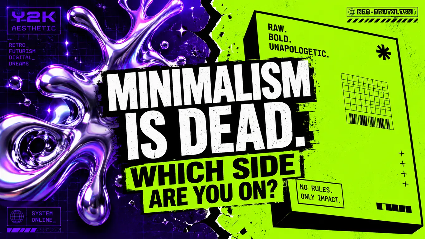
Y2K Aesthetic vs Neo-Brutalism: Which Trend is Winning in 2026?
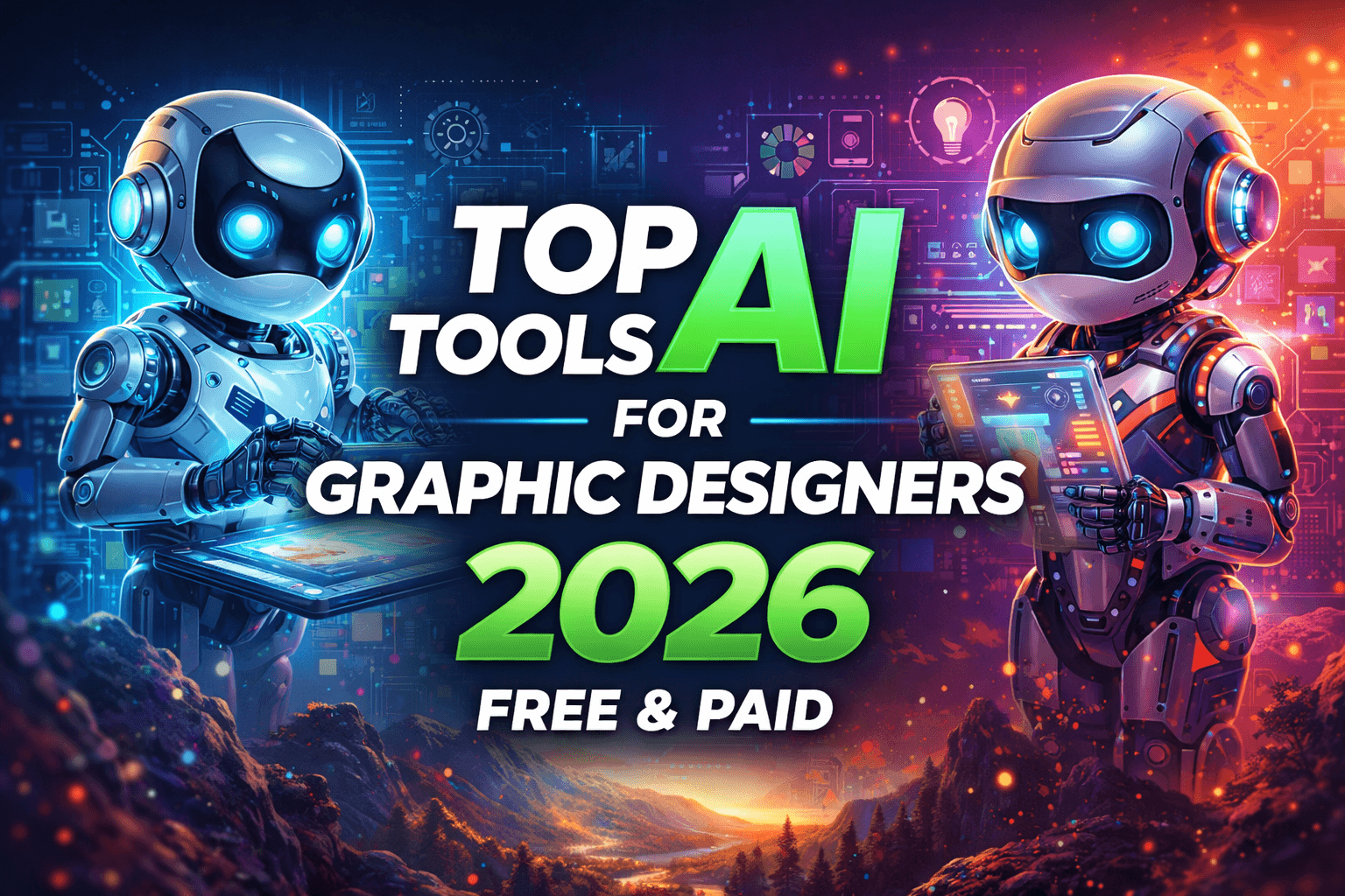
Top Logo Design Trends 2026 (With Real Brand Examples You Should Know)
Top Graphic Design Trends in 2025
Top 9 Logo Design Trends of 2021
New: Top 8 Graphic Design Trends 2019