10 Raw Black and White Photography Examples for Graphic Design Inspiration
In a digital world saturated with blinding neon lights and heavy gradients, stripped-down monochrome imagery holds a distinct power. Black and white photography forces creators to focus entirely on texture, raw contrast, framing, and light ergonomics without the distraction of color. For elite graphic designers and creative directors looking to build high-converting editorial layouts, brutalist branding campaigns, or high-end magazine spreads, these raw examples of black and white photography provide the ultimate spatial inspiration. If you appreciate emotionally powerful monochrome imagery, don’t miss Haunting Black and White Portraits of Homeless People, a striking collection that captures raw human emotion through dramatic black and white portrait photography.
Today we decided to showcase a different type of inspiration. We gathered beautiful examples of black and white photography to remind you that sometimes leaving colors aside can create a far more powerful visual impact. From emotional portraiture to cinematic street compositions, these monochrome photographs prove that simplicity, contrast, and atmosphere can often speak louder than color itself.
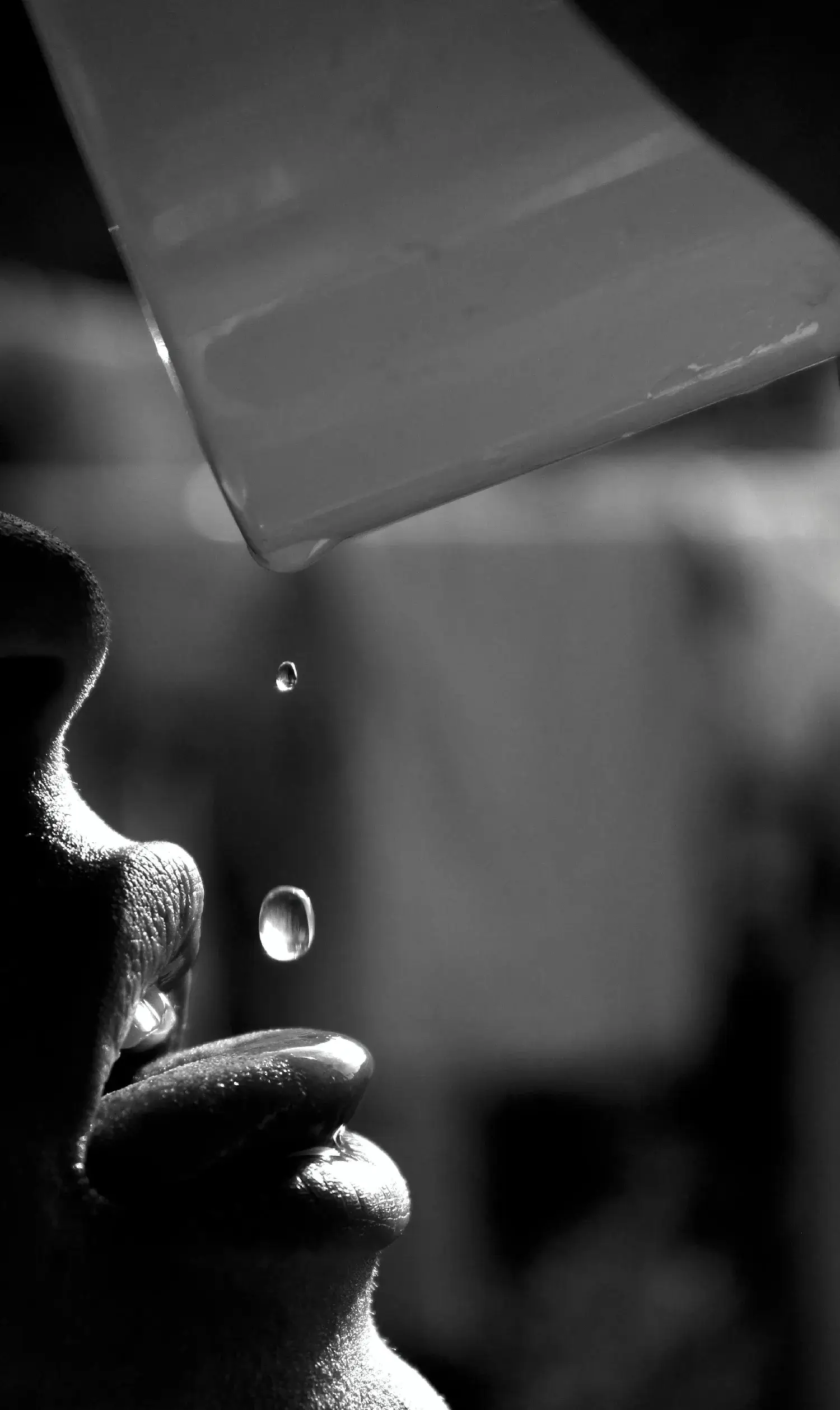
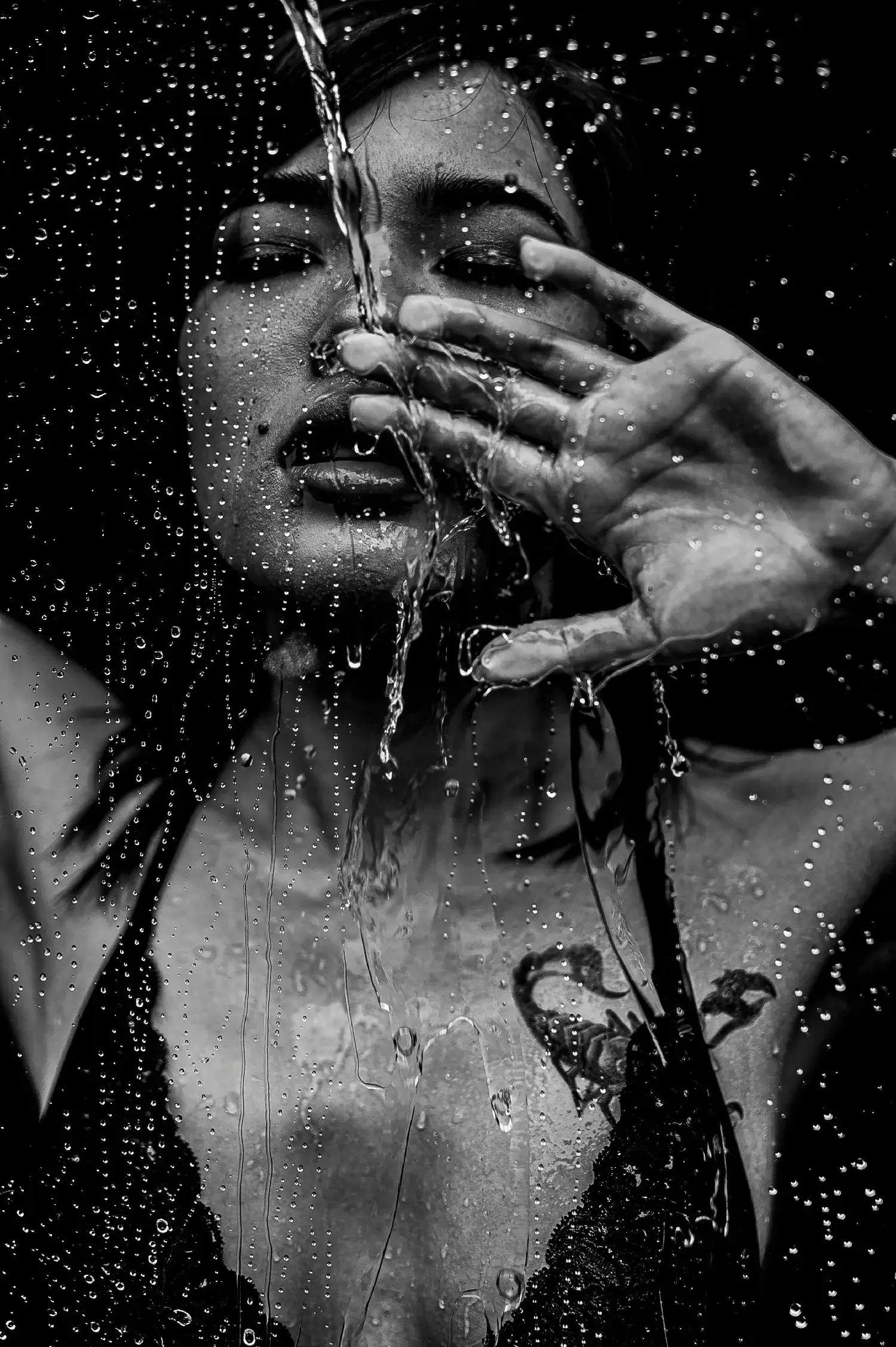
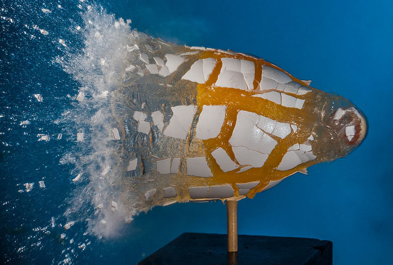
1. Conceptual Fluid Dynamics: Capturing Raw Splashes
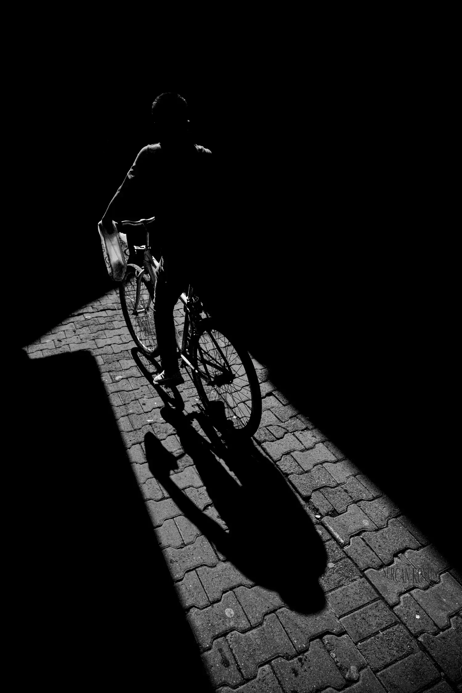
2. Elongated Silhouettes: Transforming Everyday Geometry
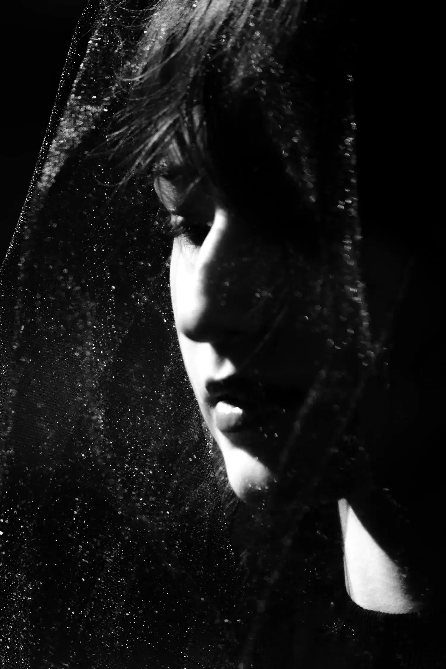
3. Low-Key Portraits: Mastering Deep Cinematic Shadows
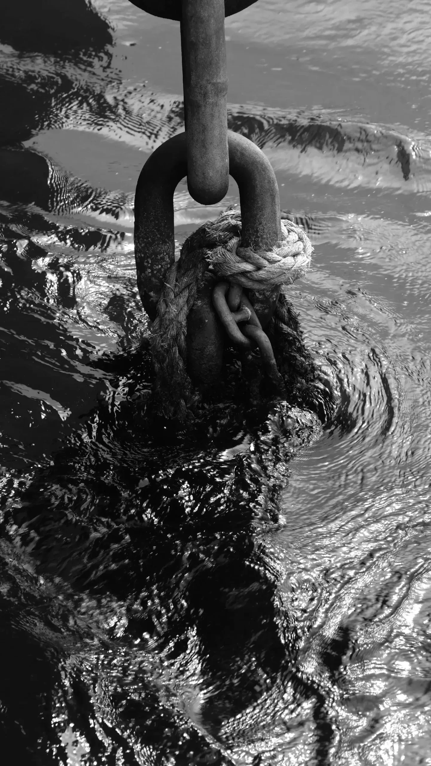
4. Industrial Textures: Documenting Brutalist Material Weight
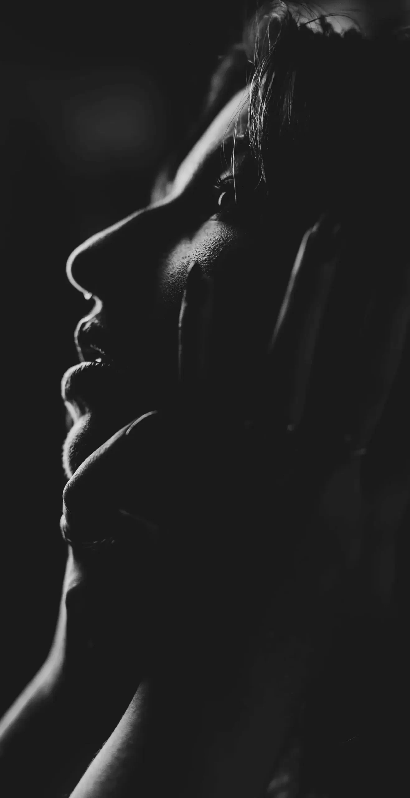
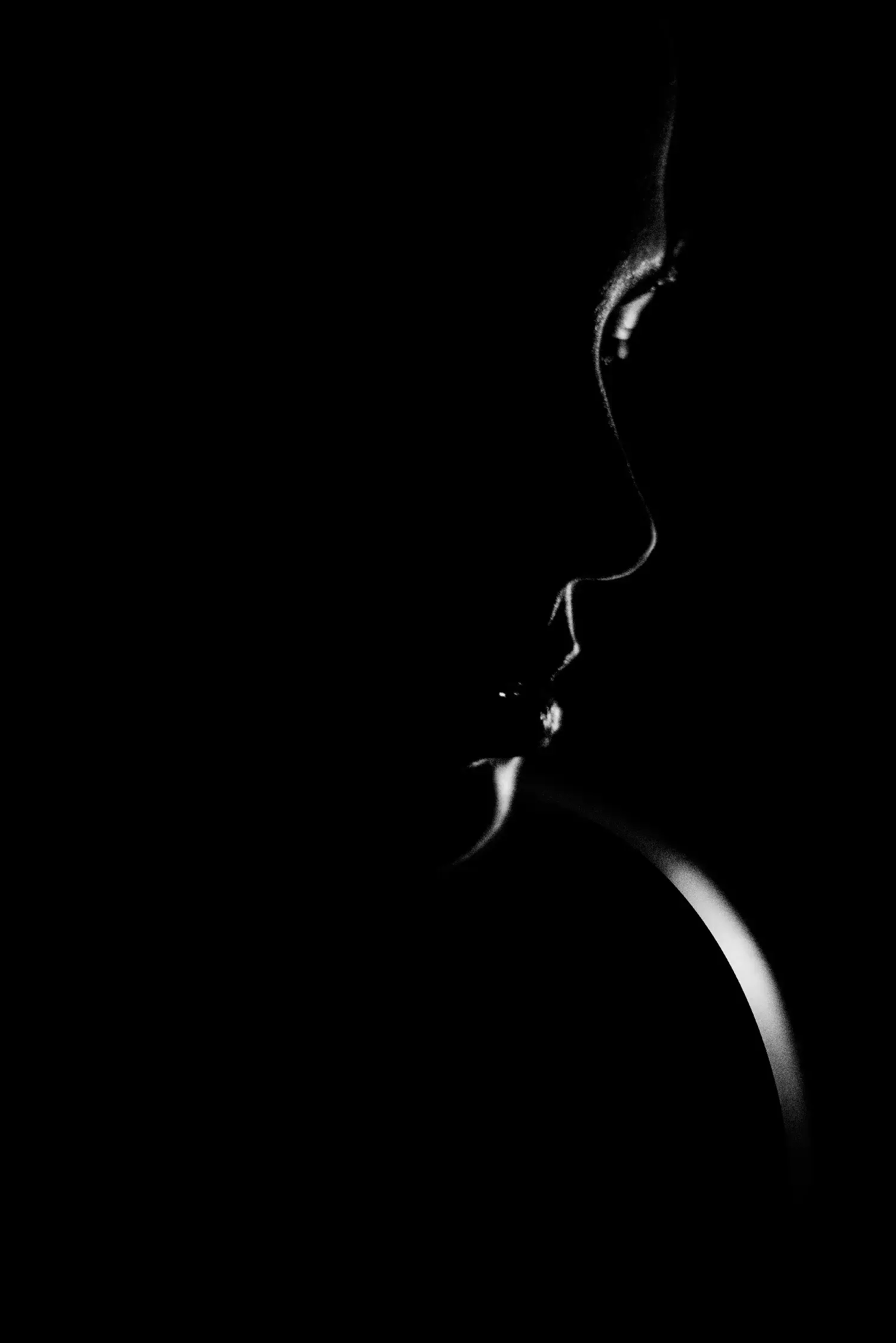
5. Profile Edge Lighting: Shaping Sharp Human Contours
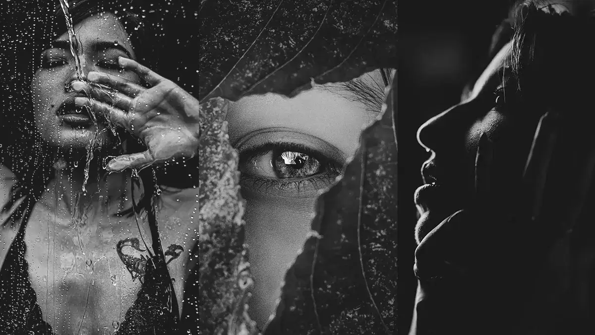
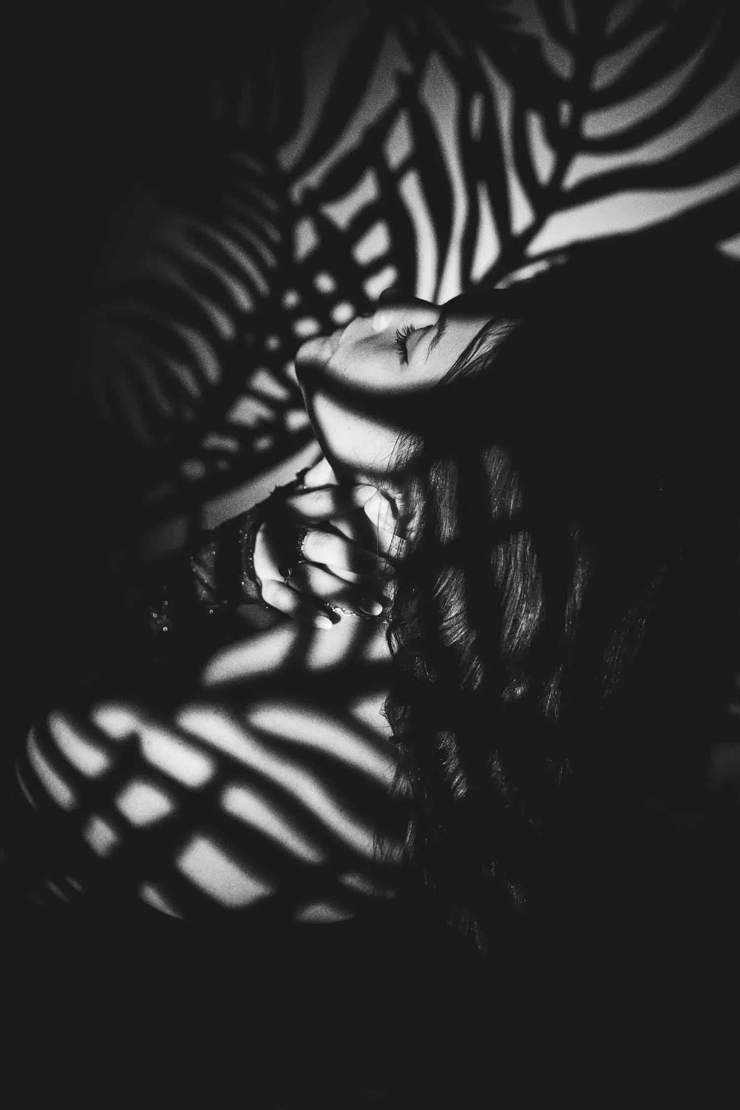
6. Organic Layering: Creating Textured Abstract Frames
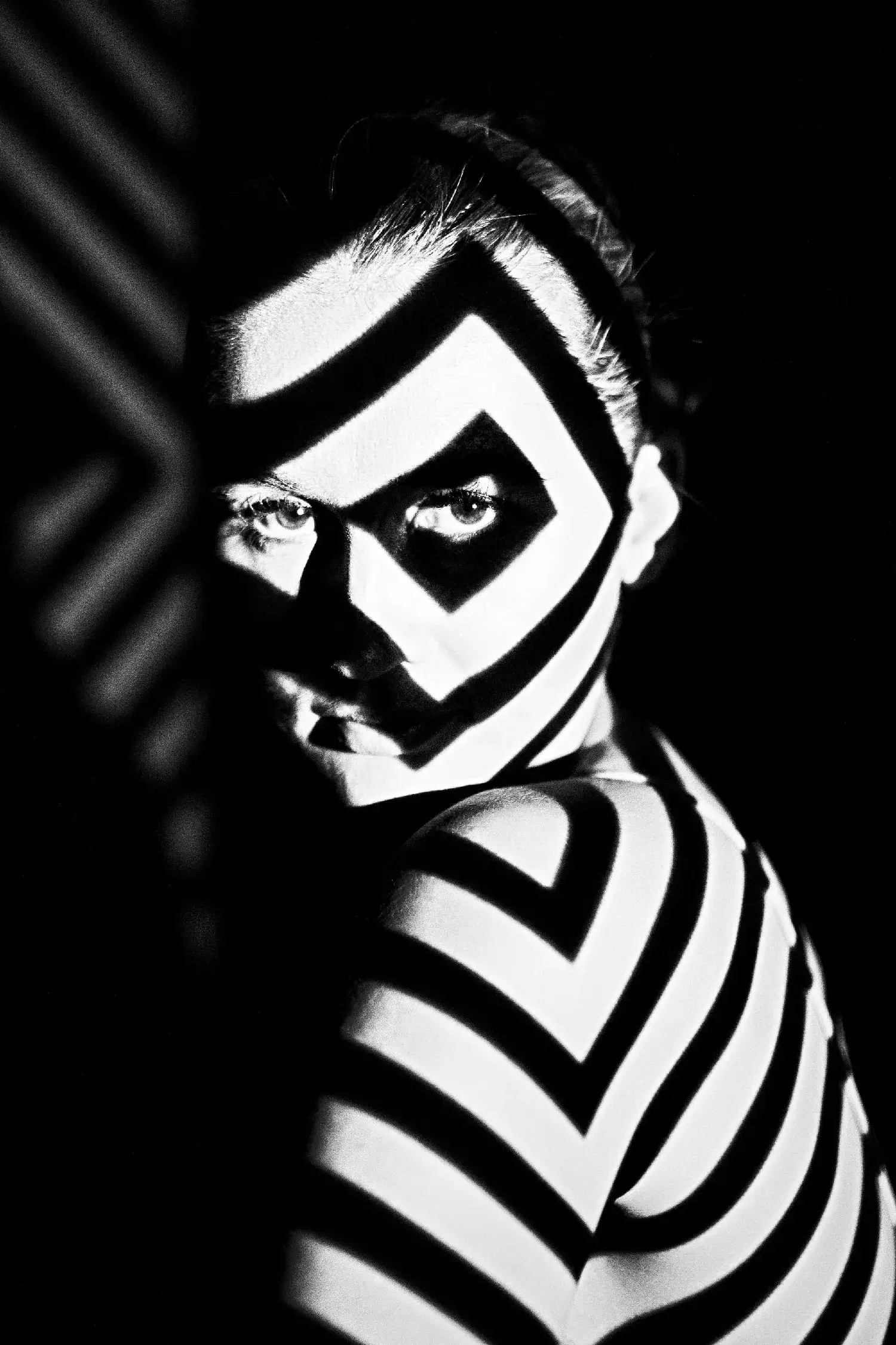
7. Linear Distortion: Projecting Aggressive Graphic Grids
8. Liquid Reflections: Embracing Visceral Studio Movements
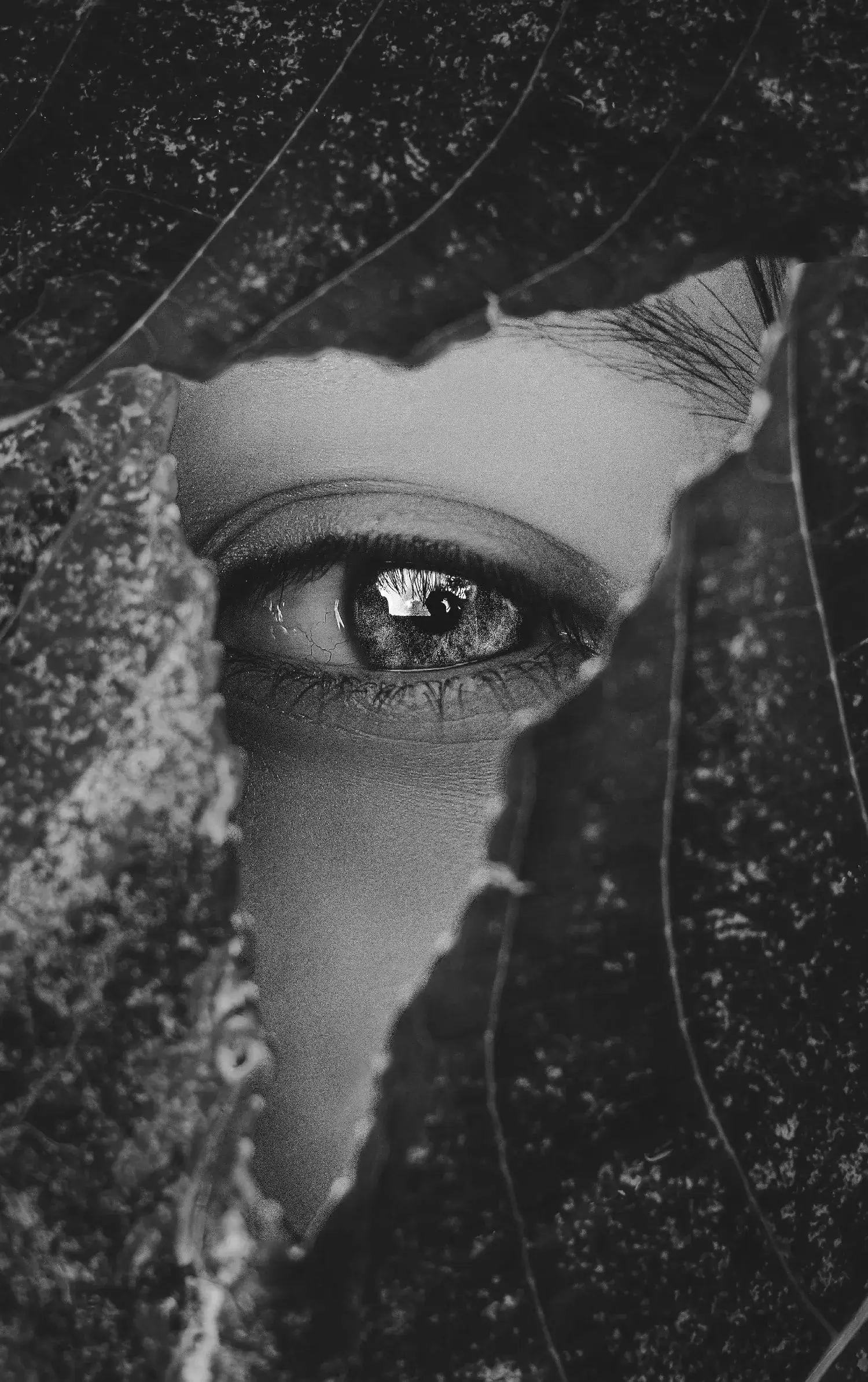
9. Environmental Overlays: Merging Nature with Visual Arts
10. Hard-Edged Minimalist: The Absolute Elimination of Midtones
FAQ
Designers use black and white photography because it completely strips away color distractions. This forces the creative team to focus purely on core spatial elements like composition, raw textural depth, geometric lighting, and visual hierarchy.
Ans: Monochrome imagery creates an instant premium, timeless, and sophisticated feel. It provides high contrast, which makes typography pop aggressively, making it highly effective for luxury apparel, architectural portfolios, and editorial web design layouts.
Ans: A punchy black and white photo relies heavily on a wide tonal range—meaning it has deep, true blacks (#000000) and crisp, clean whites rather than muddy grey midtones. Mastering the shadow curves and highlights creates that iconic high-contrast look.
Ans: Yes, it is heavily trending as a direct response to AI-generated saturation fatigue. Elite NYC and LA creative agencies are deploying raw black and white hero imagery paired with brutalist layouts to create immediate thumb-stopping power on corporate digital platforms.
Don't Miss
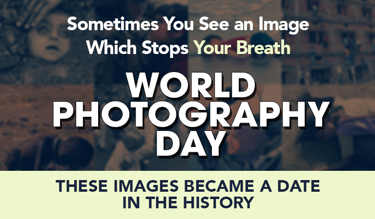
World Photography Day: These Images Became a Date In The History
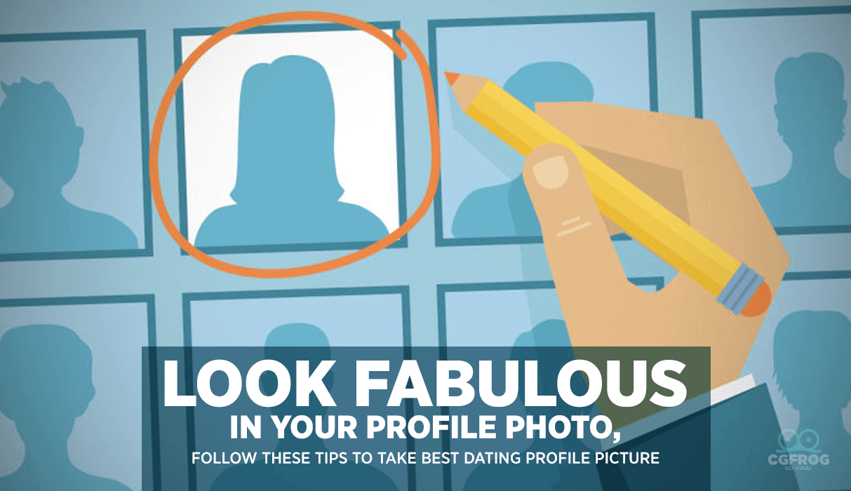
Look Fabulous in Your Photo, Follow These Tips to Take Best Dating Profile Picture
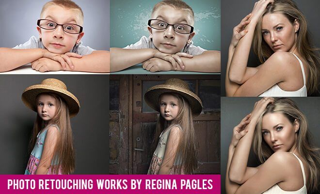
Best Portrait Photo Retouching works by Regina Pagles
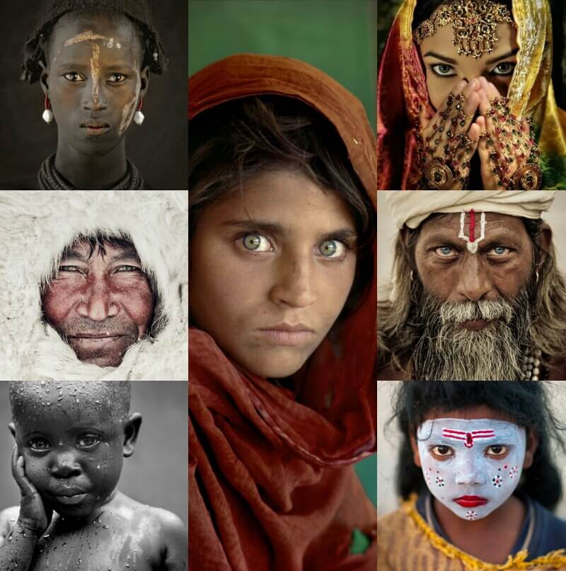
Famous Photographers – List of 10 Best Photographers in the World
Stunning & Creative Slow Motion Photography Examples