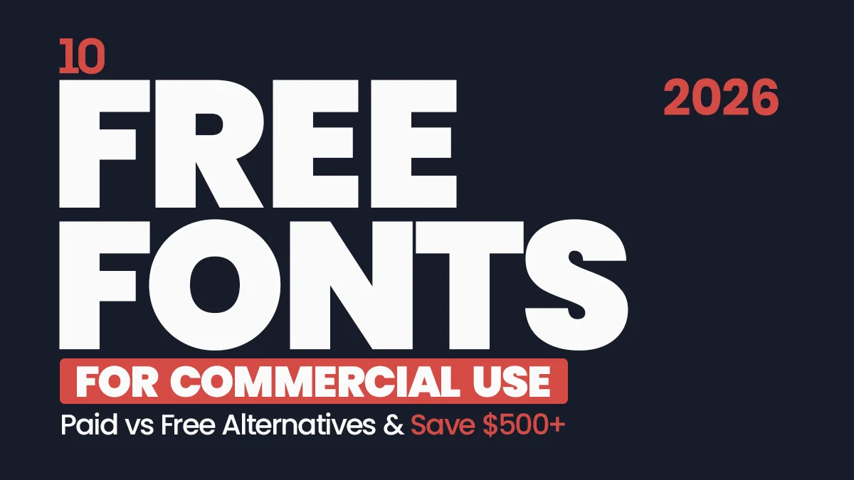
10 Best Free Fonts for Commercial Use (Famous Alternatives 2026)
Every designer knows the struggle. You fall in love with a legendary typeface like Helvetica Now or Gotham, but the client doesn’t have the $500 budget for the license.
Do you compromise on the design? Never.
In 2026, the gap between “Paid” and “Free” typography has vanished. The Open Source community has created stunning, high-quality twins of the world’s most expensive typefaces. These aren’t cheap knock-offs; they are precision-engineered tools used by top startups and developers.
We have curated the Top 10 Industry-Standard Fonts and matched them with their Best Free Alternatives.
Stop Paying for Fonts: The Pro Guide
The Cheatsheet: Paid vs. Free
| Industry Standard (Paid) | Best Free Alternative | The Vibe |
|---|---|---|
| Helvetica | Inter / Roboto | Neutral, Corporate, Clean |
| Futura | Jost | Geometric, Modern, Tech |
| Gotham | Montserrat | Trust, Friendly, Masculine |
| Proxima Nova | Urbanist | App Design, Startup, SaaS |
| Didot | Playfair Display | Luxury, Fashion, Editorial |
| Garamond | EB Garamond | Book, Academic, Timeless |
| Avenir | Nunito / Nunito Sans | Humanist, Soft, Approachable |
| Bodoni | Prata | Sharp, High-Fashion, Display |
| Gill Sans | Lato | British, Warm, Friendly |
| Century Gothic | Questrial | Perfect Circles, Wide, Sleek |
The best part? Every free font on this list is safe for Commercial Use. You can use them for logos, websites, and client work without worrying about a lawsuit.
Let’s upgrade your toolkit for $0.
Top 10 Breakdown & Downloads
1. Helvetica ($35+) vs. Inter (Free)
The King of Fonts. Helvetica is used by Apple, Target, and the NYC Subway. It is famous for its “invisible” neutrality.
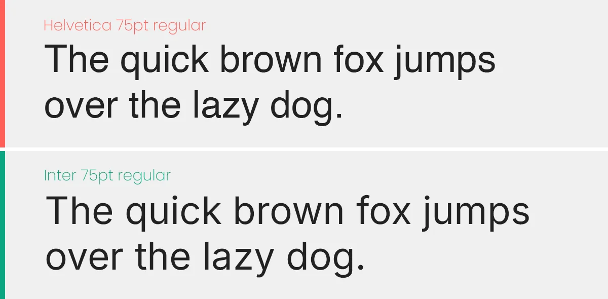
The Free Hero: Inter. Designed specifically for computer screens by Rasmus Andersson. It has a taller x-height than Helvetica, making it more readable on mobile interfaces while keeping that Swiss neutrality.
2. Futura ($30+) vs. Jost* (Free)
The Geometric Pioneer. Futura is constructed from perfect circles and triangles. It is the font of Nike, Supreme, and Wes Anderson films.
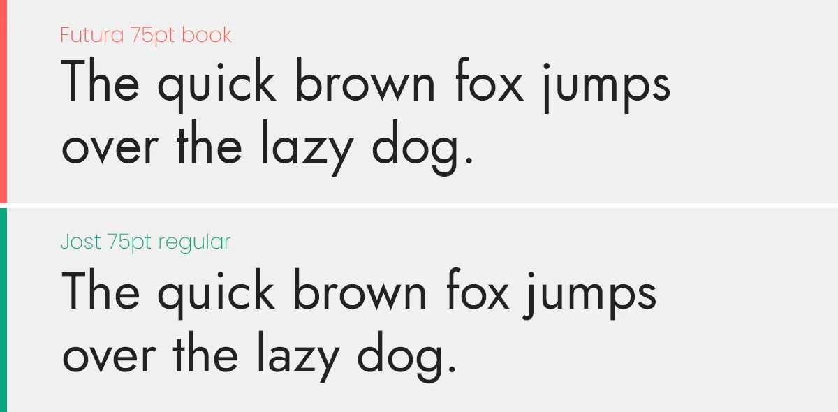
The Free Hero: Jost*. It captures the exact geometric spirit of Futura but fixes the issues with digital rendering. It also includes a “Variable” weight, allowing you to fine-tune the thickness.
3. Gotham ($200+) vs. Montserrat (Free)
The American Classic. Gotham screams “Trust.” It was used in the Obama campaign and is the standard for banking and masculine branding.
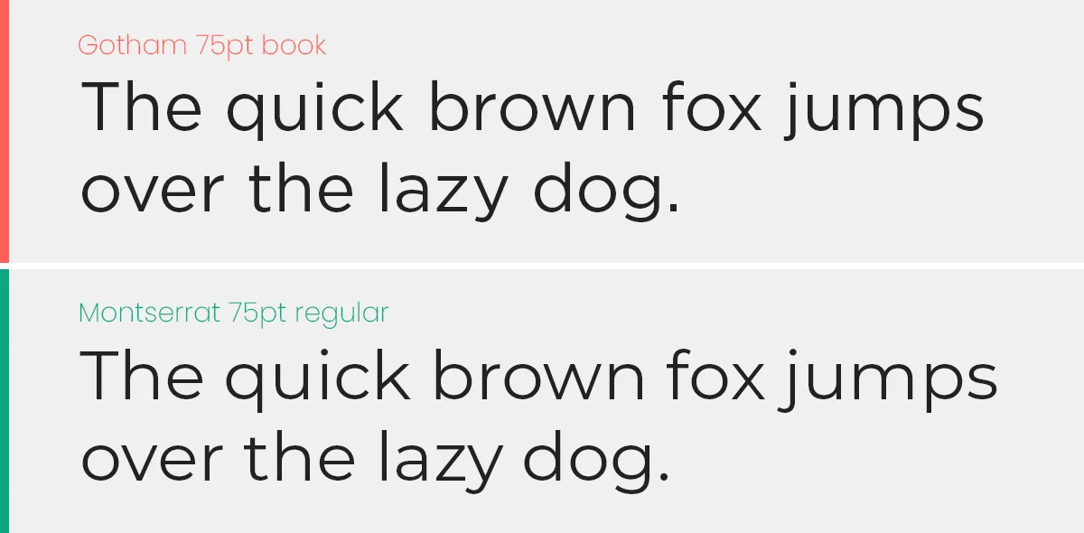
The Free Hero: Montserrat. Inspired by signage in Buenos Aires, it is slightly wider and friendlier than Gotham but carries the same “bold architecture” weight.
4. Didot ($40+) vs. Playfair Display (Free)
The Fashion Icon. High contrast (thick lines and thin lines). Used by Vogue and luxury brands. It is expensive to license and hard to print.
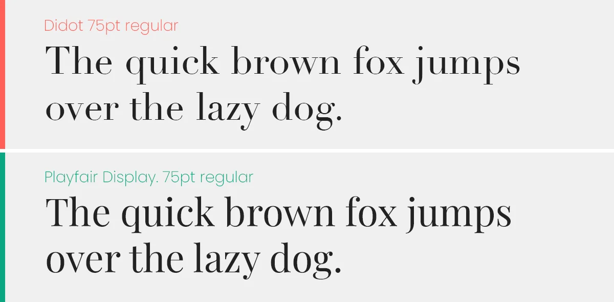
The Free Hero: Playfair Display. It mimics the high-contrast “Didone” style but has a slightly softer, transitional feel that works better on screens than the razor-thin lines of Didot.
5. Proxima Nova ($30+) vs. Urbanist (Free)
The Startup Darling. For the last decade, Proxima Nova was the “official font of the internet” (used by BuzzFeed, Mashable, NBC). It bridges the gap between Futura and Helvetica.
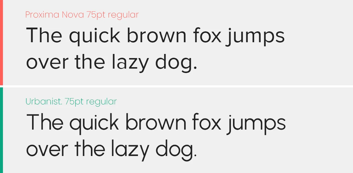
The Free Hero: Urbanist. This is the new standard for 2026. Created by Corey Hu, it captures that same low-contrast, “friendly tech” aesthetic. Plus, it is a Variable Font, meaning you can pick the exact thickness you want.
6. Garamond ($40+) vs. EB Garamond (Free)
The Book Standard. The most legible serif ever created. Used for Harry Potter and Dr. Seuss.
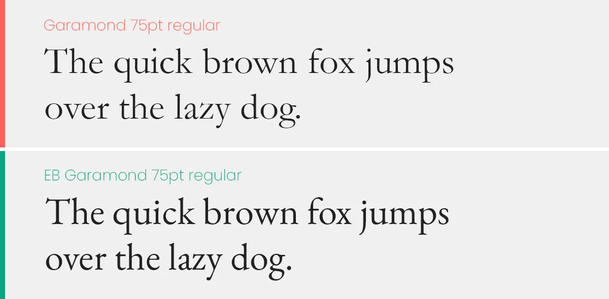
The Free Hero: EB Garamond. This is a community-led revival of the original 16th-century design. It is actually more historically accurate than some paid versions.
7. Avenir ($40+) vs. Nunito (Free)
The Humanist Sans. Avenir means “Future” in French. It is geometric but “soft,” making it very approachable.
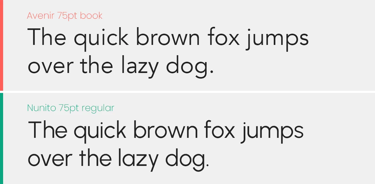
The Free Hero: Nunito. While slightly more rounded than Avenir, it captures the same “Humanist” vibe. For a sharper look, use Nunito Sans.
8. Bodoni ($40+) vs. Prata (Free)
The Italian Masterpiece. Similar to Didot but with a “Modern” vertical axis. It is sharp, mechanical, and aggressive.
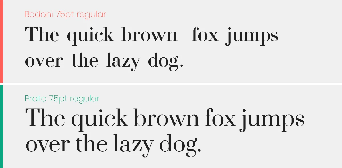
The Free Hero: Prata. Designed specifically for display sizes, Prata captures the sharp serifs and strong vertical stress of the Bodoni family.
9. Gill Sans ($40+) vs. Lato (Free)
The British Classic. Known as the “Helvetica of England,” it is used by the BBC and the London Underground.
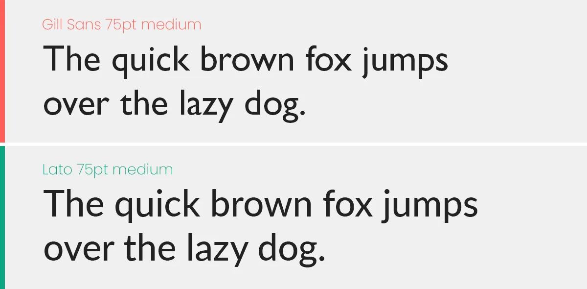
The Free Hero: Lato. While not a direct clone, Lato shares the same “Humanist” structure (semi-rounded details) that gives Gill Sans its warmth.
10. Century Gothic ($40+) vs. Questrial (Free)
The Circular Giant. A large, wide geometric font often used for movie posters and sleek headings.
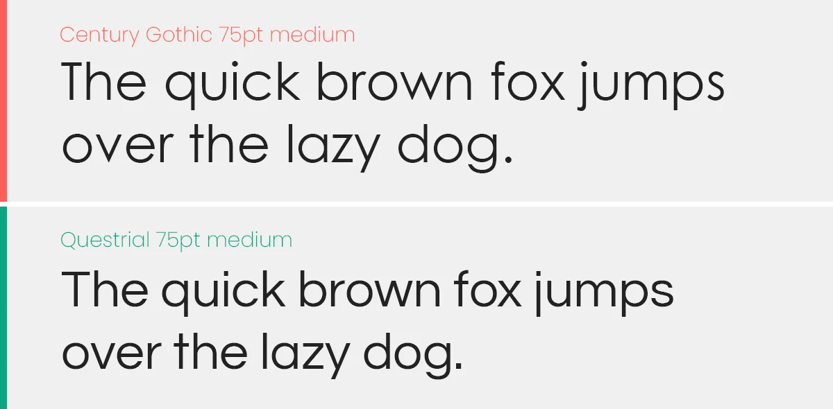
The Free Hero: Questrial. It matches the perfect circles and single-story ‘a’ of Century Gothic almost perfectly, optimized for the web.
FAQ
Here are the answers to the most common questions freelancers and designers have about using free fonts for paid client work. Adding this section to the bottom of your post will help you rank for “People Also Ask” queries on Google.
It means you can use the font in a project where you are making money (e.g., a client’s logo, a business website, or a printed brochure) without paying a licensing fee. However, you cannot sell the font file itself.
Yes. Most fonts on Google Fonts operate under the Open Font License (OFL). This allows you to use them in logos and branding.
While you can trademark the logo design (the artwork), you cannot trademark the font software itself. Anyone else can use the same font for their logo too.
Stop. Do not email the actual .ttf or .otf file to your client. Even with free fonts, “redistributing” the file can technically violate the license.
The Pro Way: Send your client the link to the Google Fonts or Fontshare page so they can download it themselves. This protects you legally.
You will see the tag variable on many fonts in this list (like Inter and Urbanist).
Old Way: You install separate files for “Bold”, “Light”, and “Regular.”
New Way (2026): You install one single file that contains every weight. It loads faster on websites and gives you infinite control over thickness.
Absolutely. All the fonts listed (Inter, Manrope, Urbanist) are optimized for the web. You can embed them directly using Google Fonts API or self-host them. They are much lighter and faster than older paid fonts.
Quick Troubleshooting
The font isn’t showing up in Photoshop/Figma?
- Restart: After installing a font, you must restart your design software.
- Variable Support: If you downloaded a Variable font and it looks weird, try installing the “Static” versions (Regular.ttf, Bold.ttf) included in the zip folder. Older versions of Photoshop sometimes struggle with Variable axes.
Don't Miss

17 Habits of a Bad Graphic Designer
Font Combining Principles – Top 10 Font Combinations Golden Rules
Typography Quiz: Take This Quiz To Test Your Skills
25 Best Clever Logos of Common Words in English Nouns
16 Awesome Typographic Animations of Different Words by Mindaugas Dudenas
